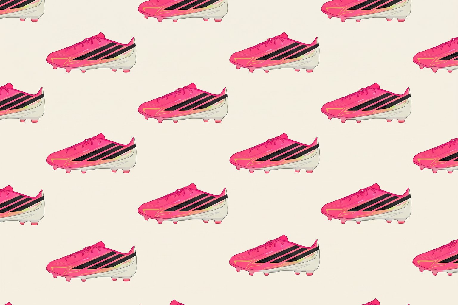
If you’ve been watching any major soccer tournament lately, you’ve probably noticed something strange: a disproportionate number of players are wearing bright pink cleats. Not just one team. Not one brand. Pink is everywhere, from Adidas to Nike to Puma, showing up on feet across the pitch like someone sent a memo no one told the rest of us about.
At first glance, it feels like marketing synchronicity, the kind of trend that bubbles up when brands chase the same demographic at the same time. But dig a little deeper and the story gets more interesting. Pink isn’t just trendy. It’s tactical.
On a regulation green field under high-powered stadium lights, pink creates the highest color contrast of almost any shade in the spectrum. That matters more than you’d think. Players rely on peripheral vision to track teammates and opponents during fast breaks, and a flash of pink at foot level registers faster than black, white, or even neon yellow. Referees can spot potential fouls more clearly when they can see exactly where a player’s foot lands. Broadcast cameras, which struggle with motion blur during rapid play, pick up pink with unusual sharpness. What looks like a bold aesthetic choice is actually solving several functional problems at once.
The rise of pink cleats also reflects the reality of modern sports endorsements. Professional players at the World Cup level don’t buy their own boots. They’re contracted to wear specific brands, and those brands rotate through seasonal colorways to keep their product lines feeling fresh and to generate social media buzz. A new cleat color can drive millions in sales if it gets enough screen time during a marquee match. Pink has proven especially effective because it photographs well, stands out in highlight reels, and appeals to younger players who want to emulate what they see on the biggest stages.
But this isn’t the first time a loud color has dominated the game. Neon yellow had a long run in the 2010s, thanks in part to visibility studies that showed referees were less likely to miss calls when players wore high-contrast footwear. Before that, metallic silver and electric orange each had their moments. What’s different about pink is its staying power. While other colors cycle in and out as trends, pink has remained in heavy rotation across multiple brands and multiple seasons because it works on two levels: it’s visible and it’s expressive.
In a sport where personal flair is tightly regulated, limited mostly to hairstyles and footwear, players will take any opportunity to stand out. Pink delivers that, but it also delivers an edge. And in a game decided by fractions of a second, that edge matters. The fact that it looks good on camera is just a bonus.
The convergence isn’t coincidence. It’s what happens when independent design teams, working for competing brands, all solve the same problem and arrive at the same solution. Pink wins because it performs.
Enjoyed this? Subscribe to our newsletter: https://mailchi.mp/d7ad724e9ead/jduuzlfk6n?utm_source=ig&utm_medium=social&utm_content=link_in_bio