Retro branding shows up in waves—but not always with the same impact.
Almost every client wants something that feels “timeless.” And when they say timeless, they often mean vintage. Retro. A little sun-faded around the edges. But there’s a difference between creating nostalgia and just borrowing from it.
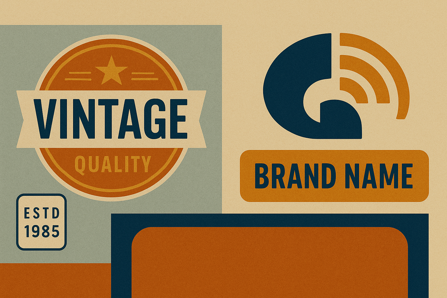
Lately, I’ve been seeing a wave of retro-heavy brand refreshes that look great in a Behance portfolio—but start to unravel when applied to a real-life product or campaign. The key isn’t just to look retro. It’s to understand why retro still resonates.
Why retro branding is more than just an aesthetic—it’s emotional design
When Liquid Death designed its tallboy water cans to look like beer, it wasn’t just a gimmick. It was a throwback to punk rock, skate culture, 1980s zines, and Monster Energy-level irreverence. The retro design didn’t just say “we’re cool”—it said “we don’t play by the rules.” That’s branding with teeth.
Same goes for Burger King. Their 2021 brand refresh tapped right into their 1969 Saul Bass–era logos and rounded color palette. But they didn’t stop at the logo. The typography, uniforms, photography, and packaging all echoed that golden era of fast food—with modern execution. That’s not nostalgia for nostalgia’s sake. That’s cultural recall with intent. It’s somewhat similar to what we did with this project for Bluebird & Co.
What works—and what flops
Some retro branding efforts nail the balance. Others just copy aesthetics without purpose.
Where some retro-inspired brands falter is in overcommitting to the “look” without backing it with a brand story or tone. If your label screams 1970s, but your messaging is pure 2025 buzzword soup, there’s a disconnect.
Take Kodak. Their full-throated return to a bold, graphic K logo from the 1970s was a hit. It leaned into the trust and familiarity of a heritage brand while aligning with a renewed interest in analog photography. But if you compare that to countless DTC startups that slap a fake “est. 1963” on a logo to appear vintage—it rings hollow.
Nostalgia is a shortcut—but not a strategy
There’s a temptation, especially for emerging brands, to use retro as a quick way to build trust or aesthetic credibility. But if you can’t answer why you’re using a certain serif font or faux-distressed badge, you’re decorating, not designing.
I’ve seen this first-hand. A client once asked us to use a “classic typewriter font” for a skincare brand targeting Gen Z. When we asked why, the answer was: “It just feels cool.” That’s fine for an Instagram Story. It’s not a brand system.
Retro branding only works when it’s era-aware—so which one are you channeling?
Retro isn’t monolithic. Are you referencing the optimism of postwar Americana? The rebelliousness of 1980s streetwear? The minimalism of 1990s anti-design? Each decade comes with baked-in values and attitudes. Design without that awareness is just mimicry.
Want to use nostalgia with precision, not just aesthetics? Let’s talk.