Project Overview
PlanetFab led the rebrand of SAMS Entertainment, a Broadway production company founded by Tony Award-winning producers Sam Biondolillo and Sam Houlihan.
The engagement transformed Samsational Entertainment into SAMS Entertainment, giving the company a name and identity built around the partnership at its center. PlanetFab developed the brand strategy and positioning, naming, verbal identity, visual identity, brand guidelines, investor materials, marketing applications, and company website.
The Challenge
Biondolillo and Houlihan had already established themselves as Broadway producers, but their company was still operating under the name Samsational Entertainment. The name expressed their personality, but it felt more playful than purposeful. It did not reflect the caliber of work they were producing or the ambition of the company they intended to build.
READ MORE +The disconnect became increasingly visible as their producing credits grew. When the 2024 Broadway revival of Our Town opened, Playbill credited Samsational Entertainment alongside established Broadway producers. The production credit was serious. The company name still felt provisional.
They needed a name and presence that could work confidently in a Playbill, an investor presentation, a production announcement, and across a growing slate of theatrical work. It also needed to preserve the resourcefulness, transparency, and collaborative spirit that shaped how they approached producing.
Discovery & Strategy
PlanetFab began with an in-person Brand Clarity Workshop with both founders.
Over the course of 75 questions, we examined the company’s vision, values, industry position, investor relationships, production strategy, creative interests, identity, and long-term ambitions.
The conversation revealed how much of the company’s character came from the relationship between its founders. Both were from Vermont and had met through community theater. They shared an entrepreneurial approach to producing, an interest in backing bold creative voices, and a belief that Broadway investing should be more transparent and collaborative.
Their distinction was not their track record alone. It was how they worked: combining creative instincts with the infrastructure required to move productions forward, while building more open relationships with investors and collaborators.
The company did not need to manufacture a point of difference. It needed to make the one it already had visible.
The Concept
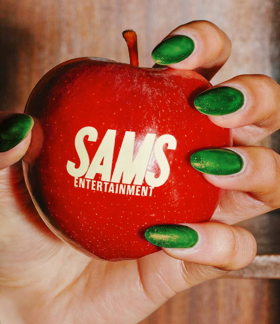
SAMS
The concept was hiding in plain sight: the company was founded by two producers, both named Sam.
Changing Samsational Entertainment to SAMS Entertainment turned that coincidence into the organizing idea for the brand. The plural name gives both founders equal presence and makes their partnership central to the company’s identity.
Short, direct, and confident, SAMS works across production credits, investor materials, digital platforms, and marketing applications without losing the founders’ personality.
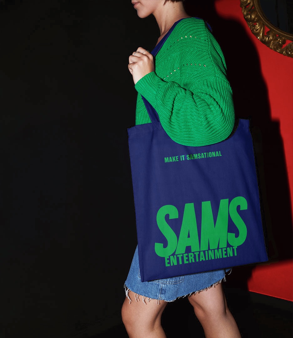
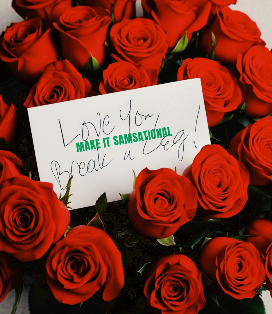
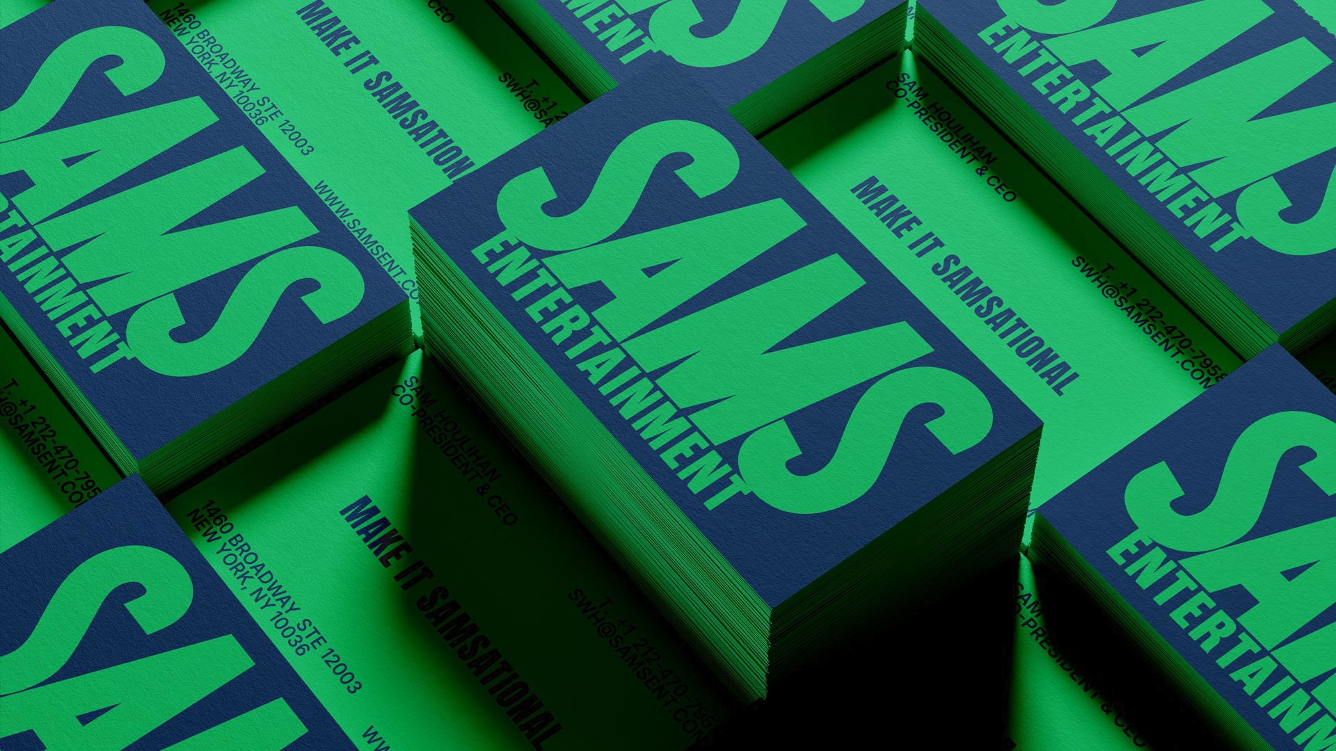
MAKE IT SAMSATIONAL became the brand’s more playful expression. It preserved the energy of the original name while allowing SAMS Entertainment to speak with greater clarity and authority.
The Identity System
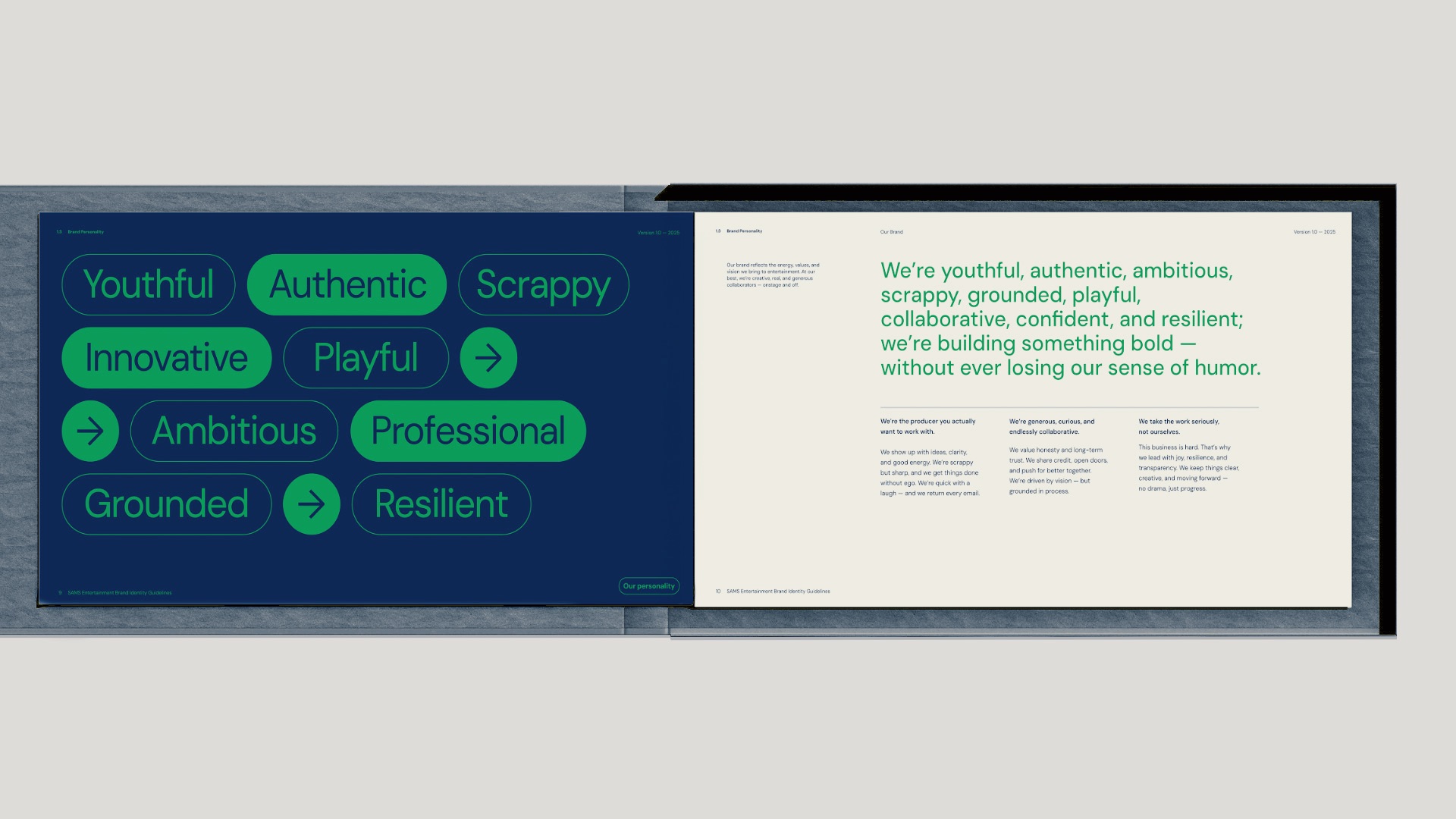
PlanetFab developed a visual and verbal identity that balances Broadway presence with the freshness of a next-generation production company.
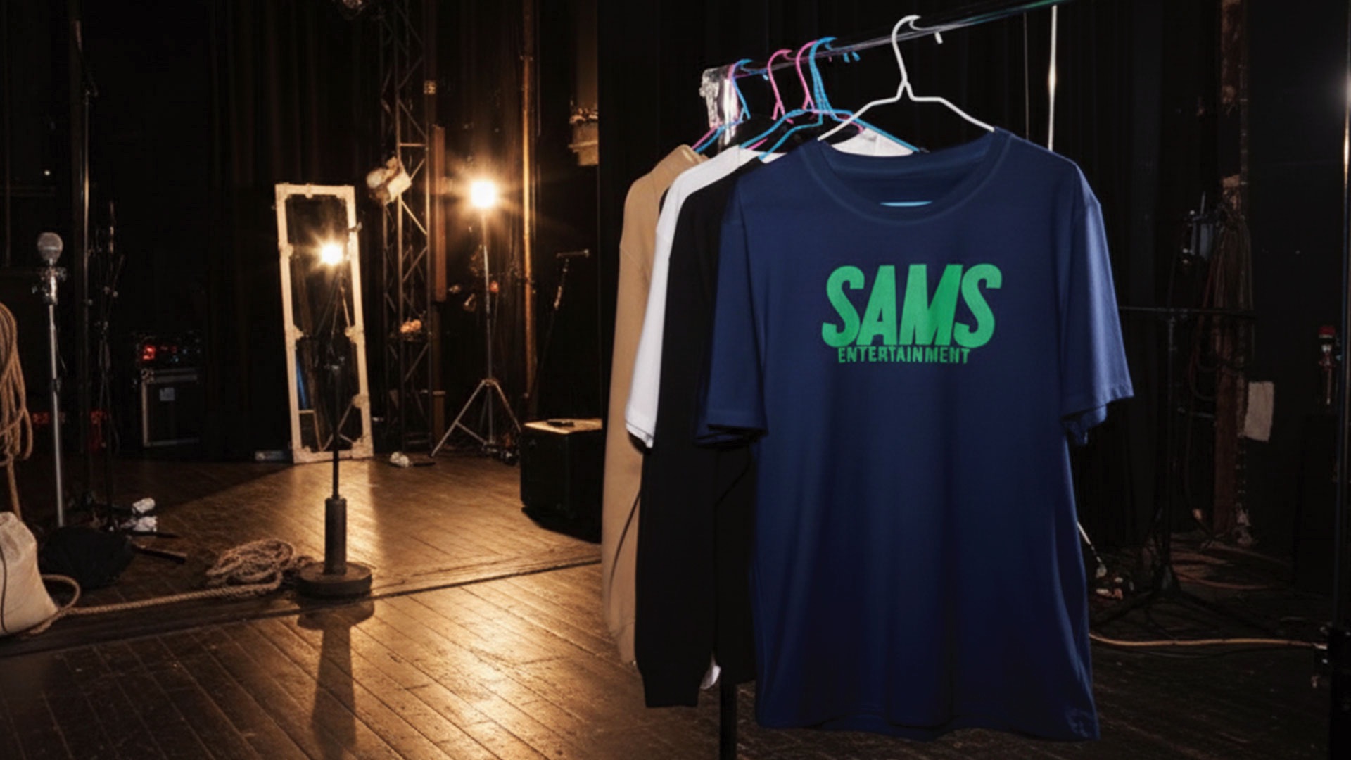
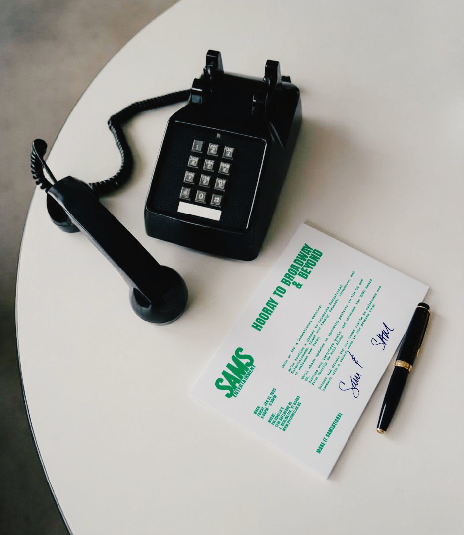
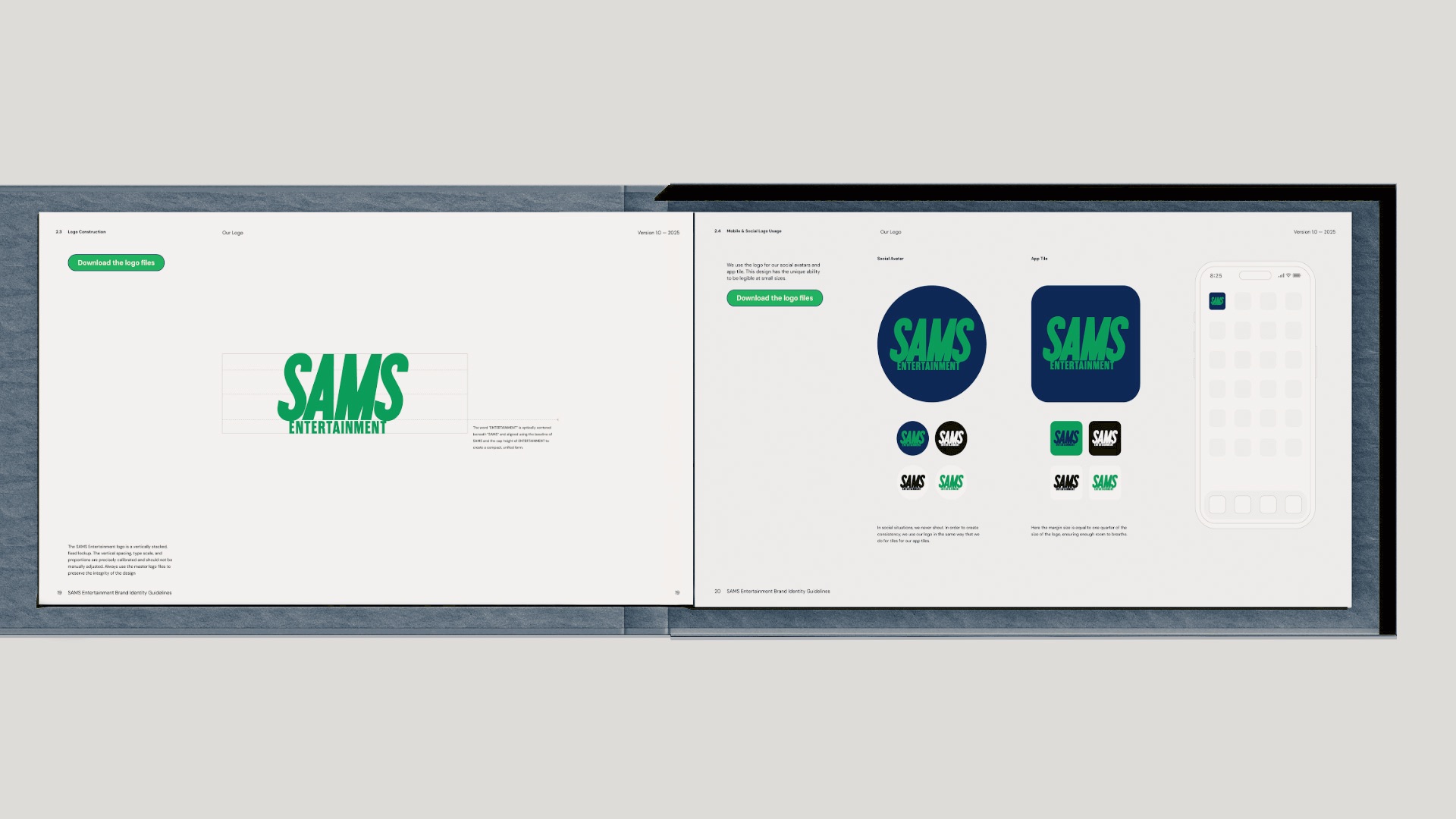
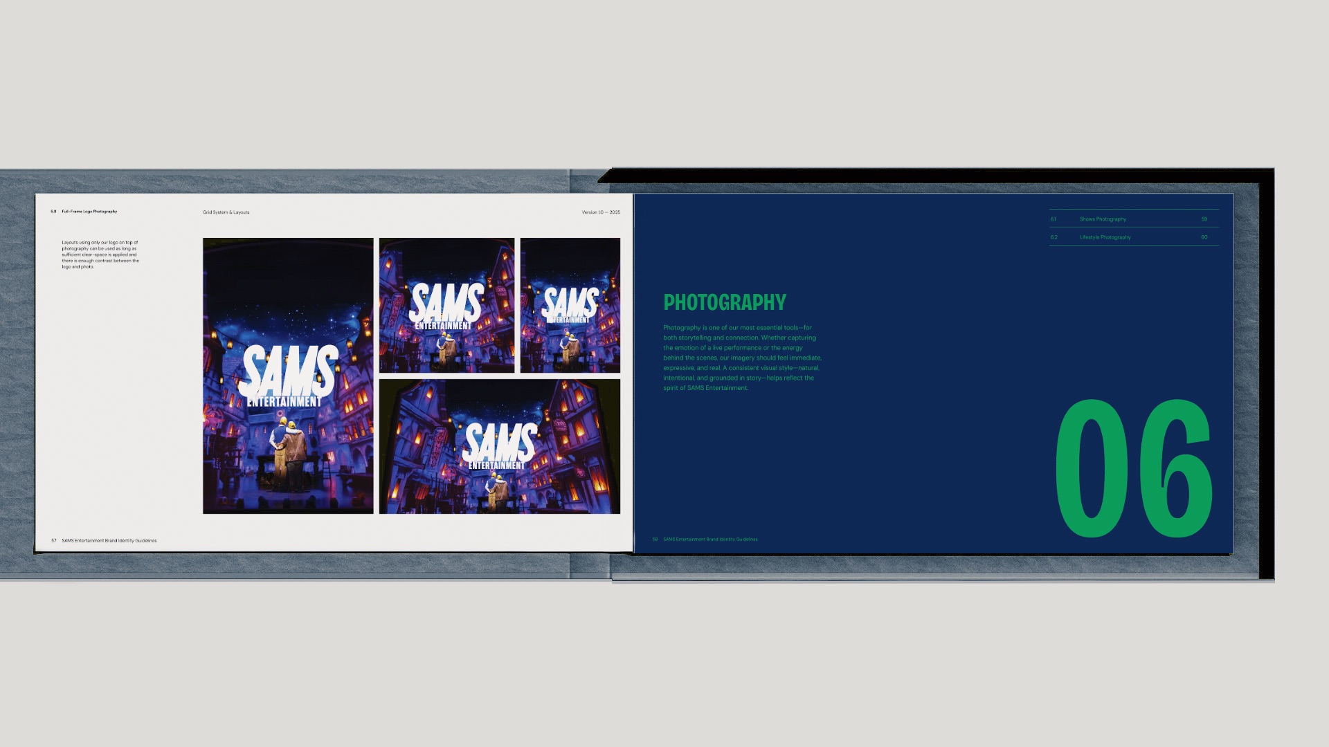
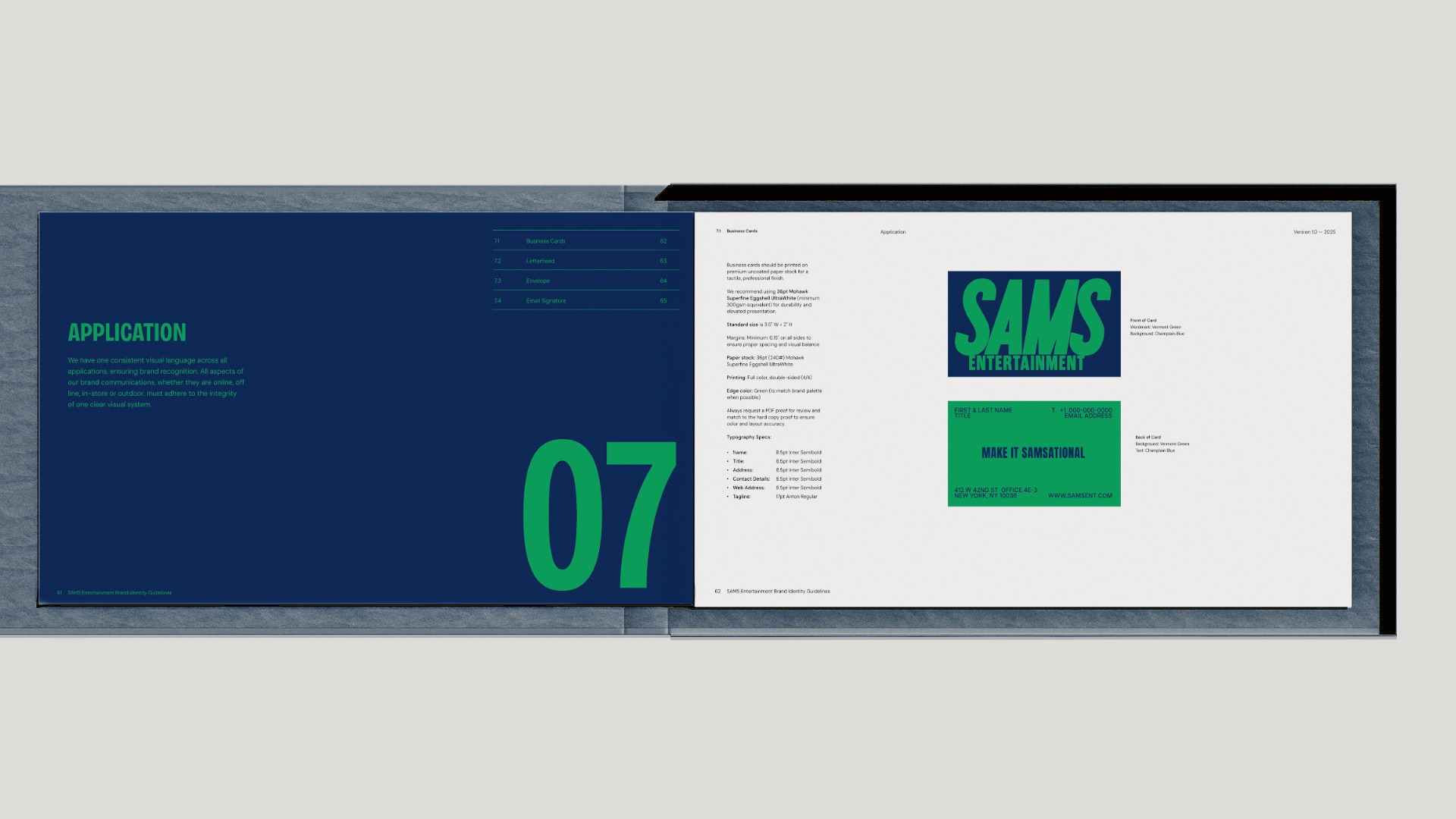
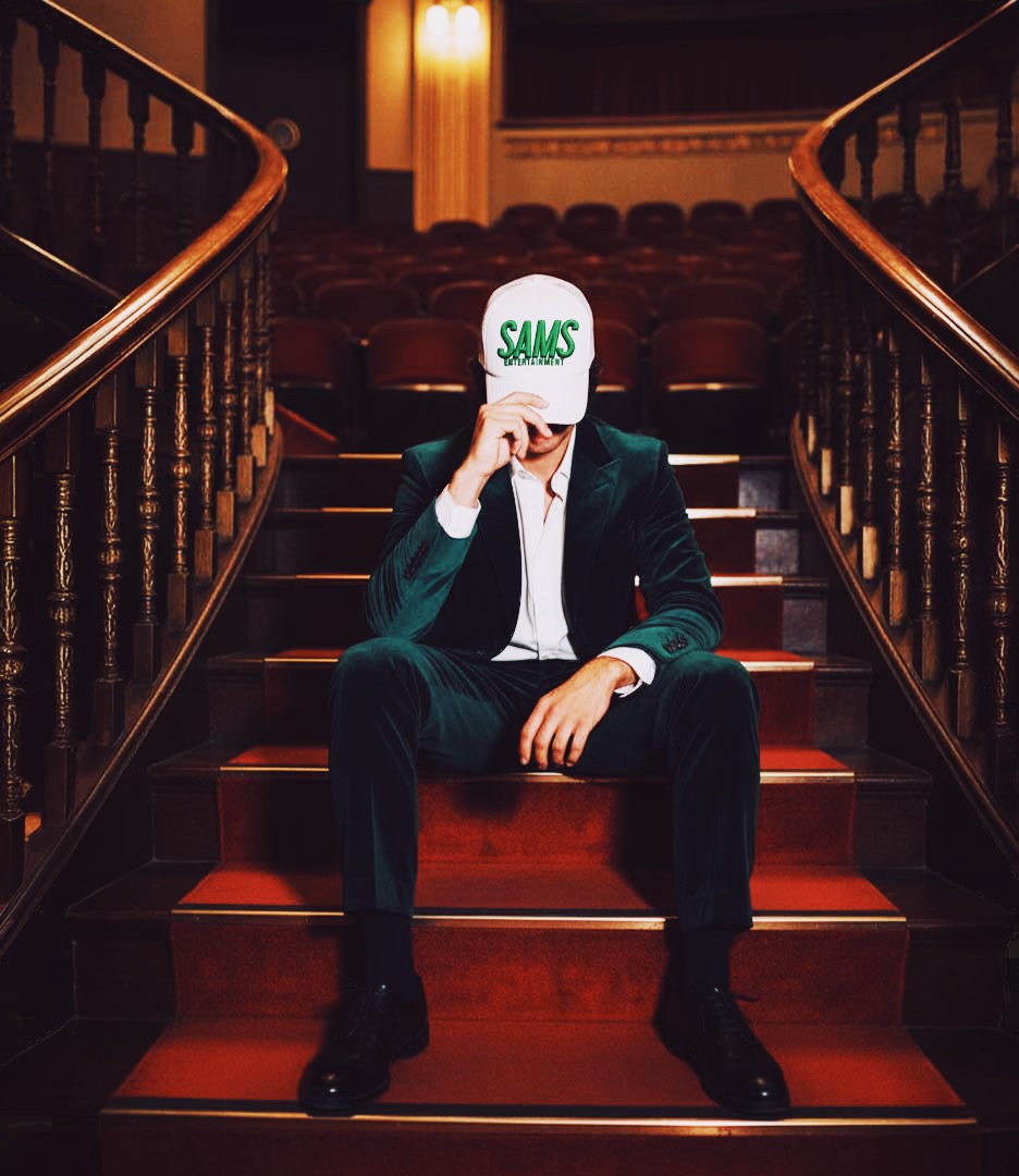
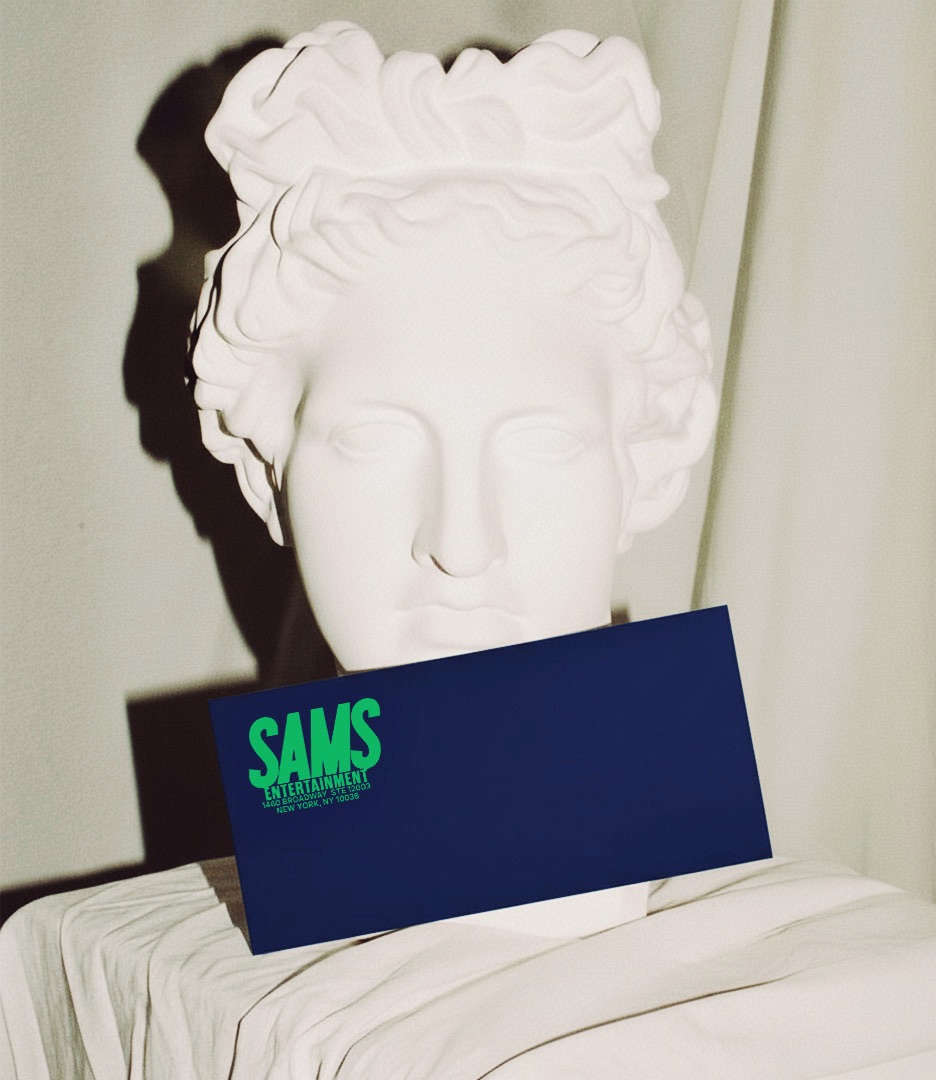
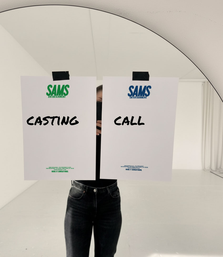
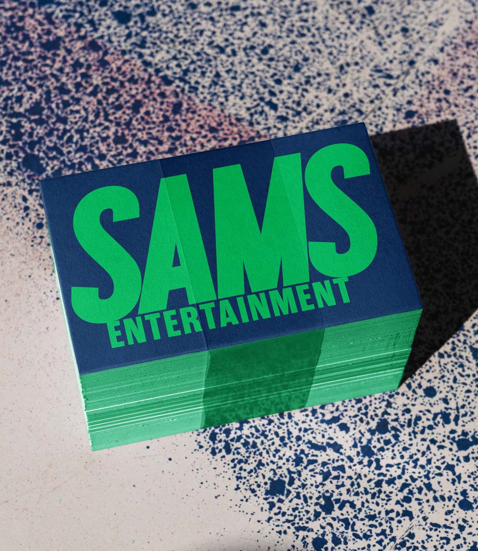
The bold SAMS wordmark stands on its own without a separate symbol. Its compact form gives the name immediate recognition and allows it to move easily across business cards, stationery, investor materials, campaign posters, apparel, and production applications.
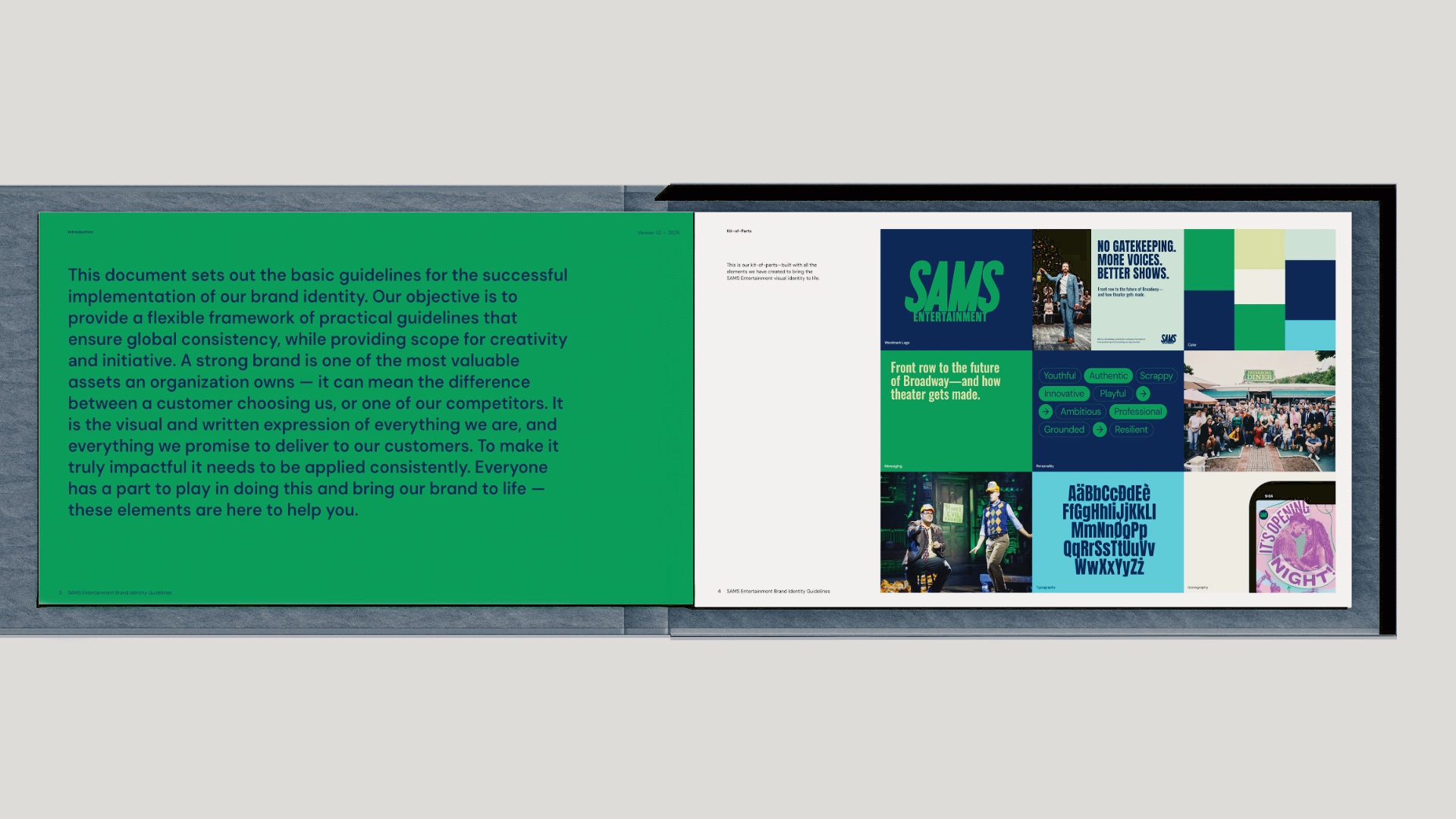
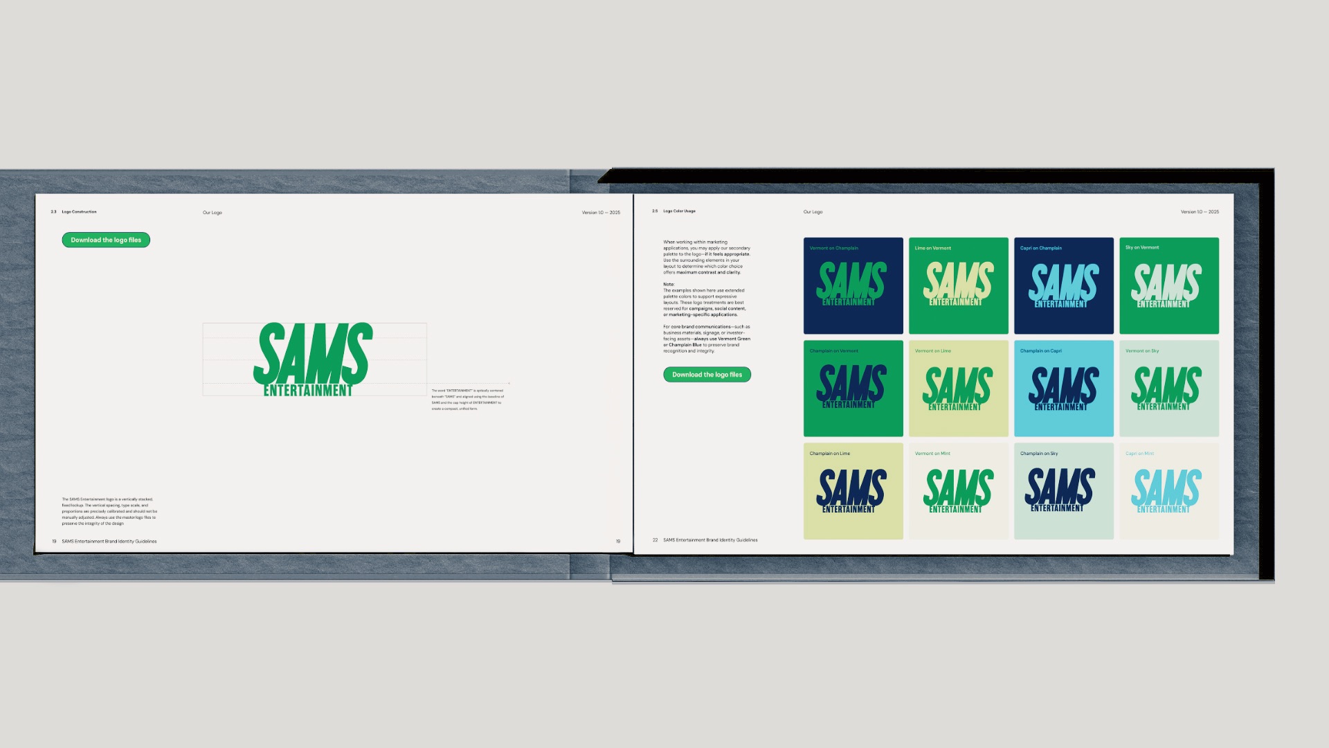
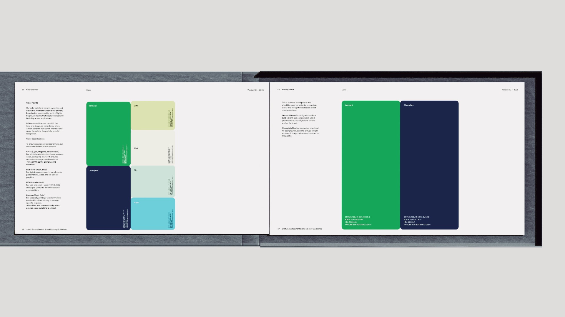
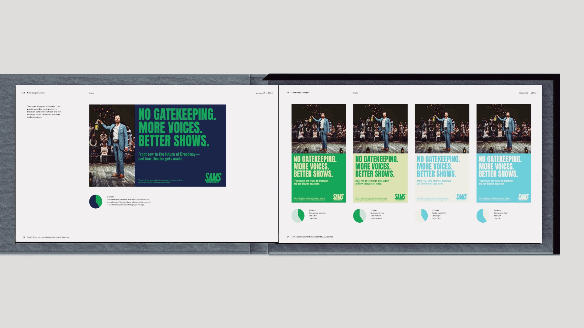
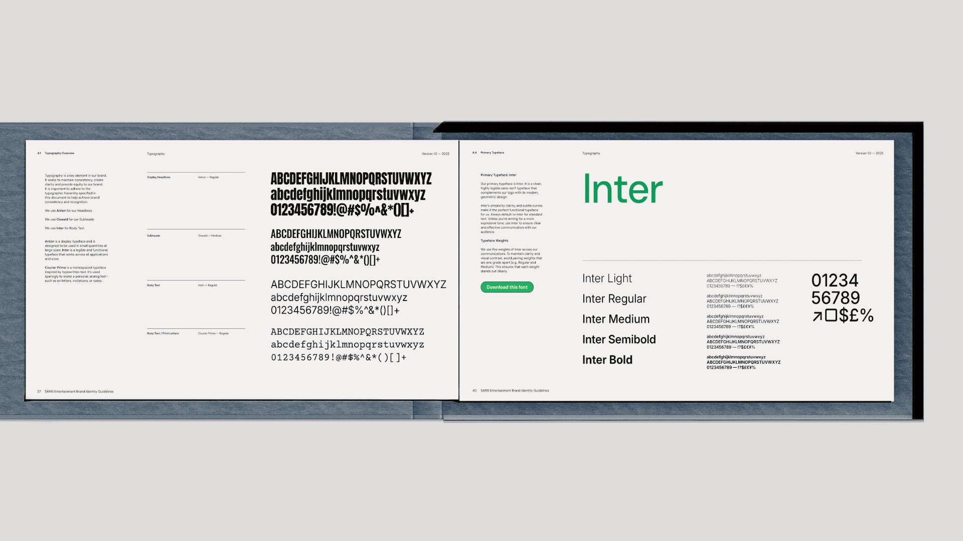
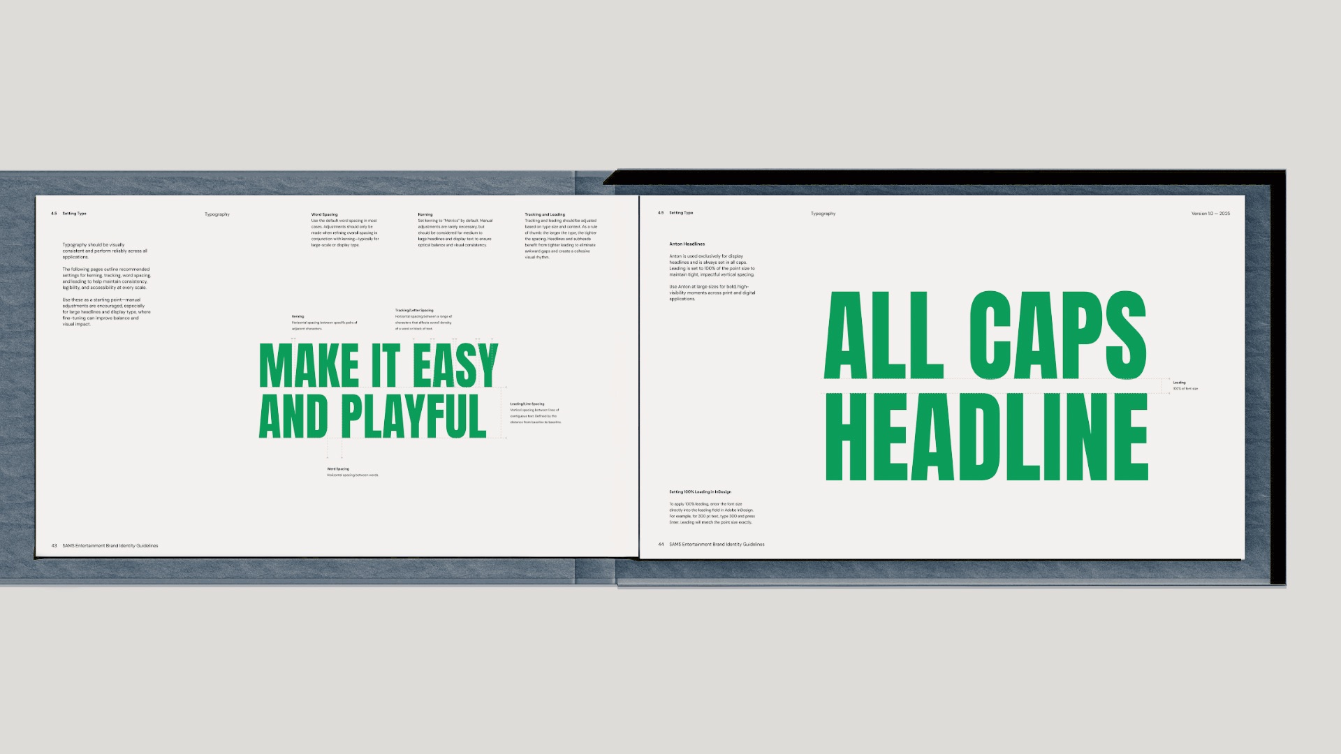
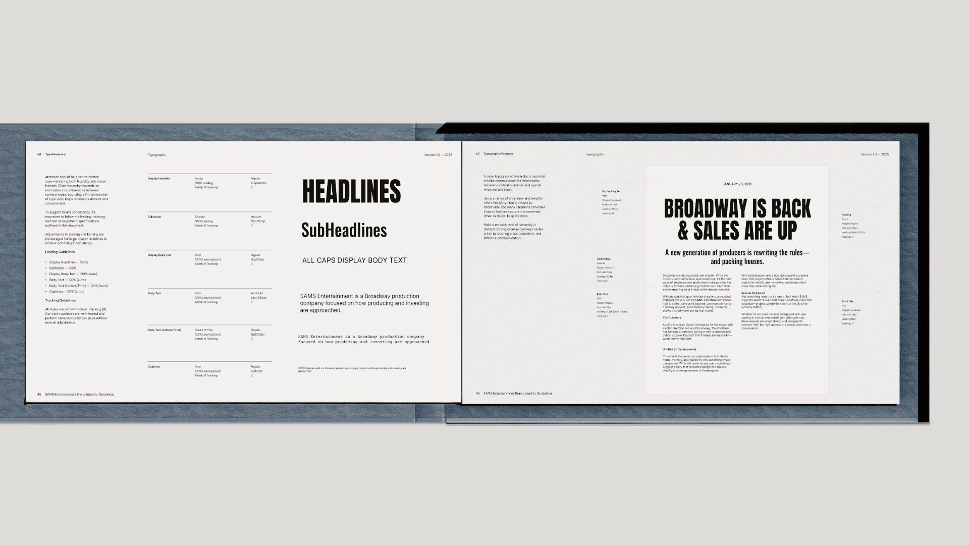
Vermont Green and Champlain Blue connect the identity to the founders’ shared roots while distinguishing SAMS from the darker, more conventional visual language associated with theatrical production companies. Inter provides a clear and flexible typographic foundation.
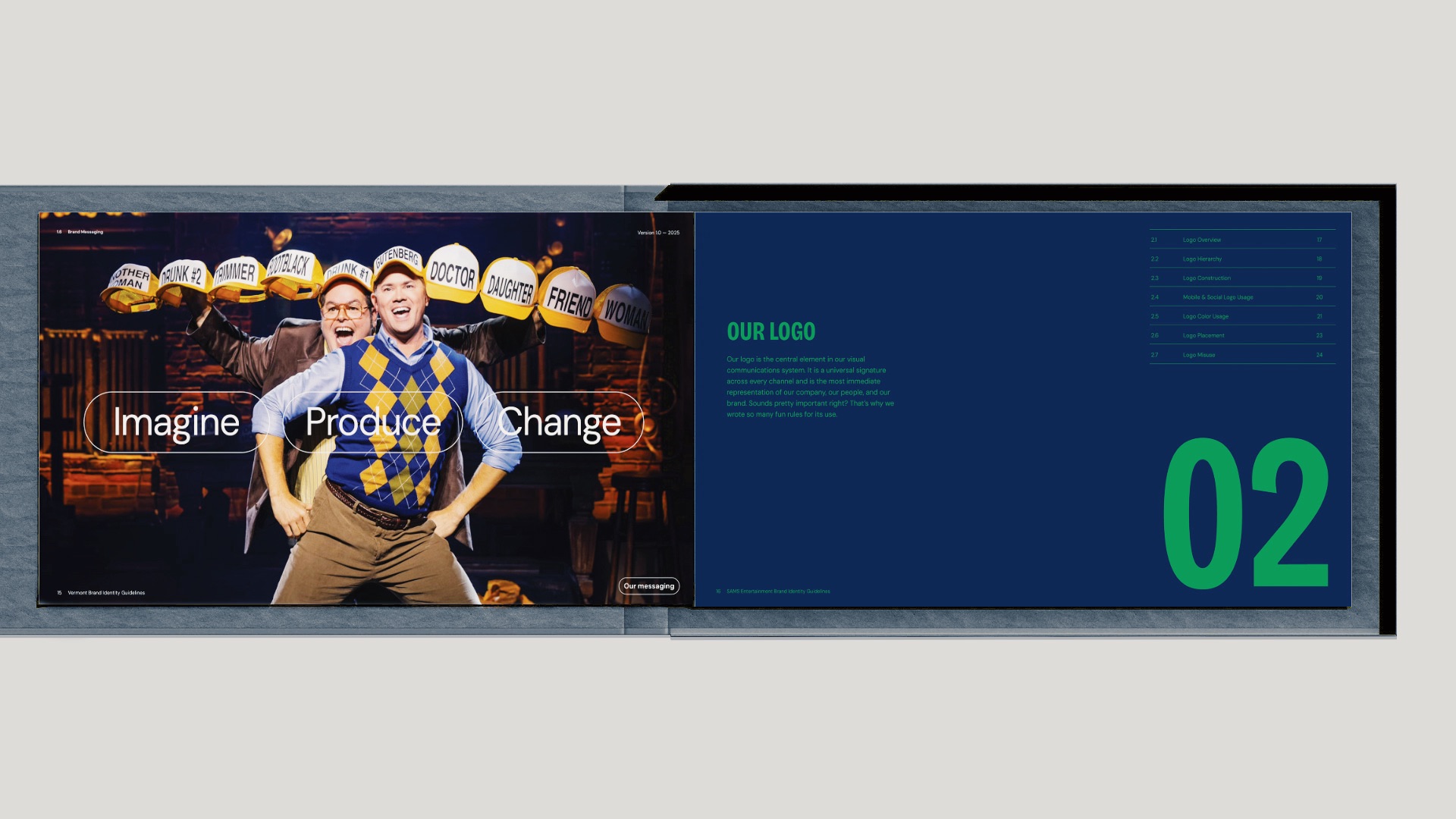
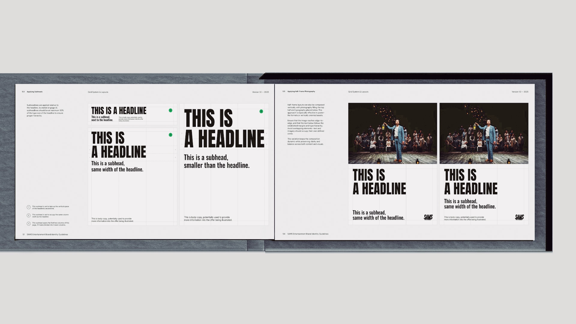
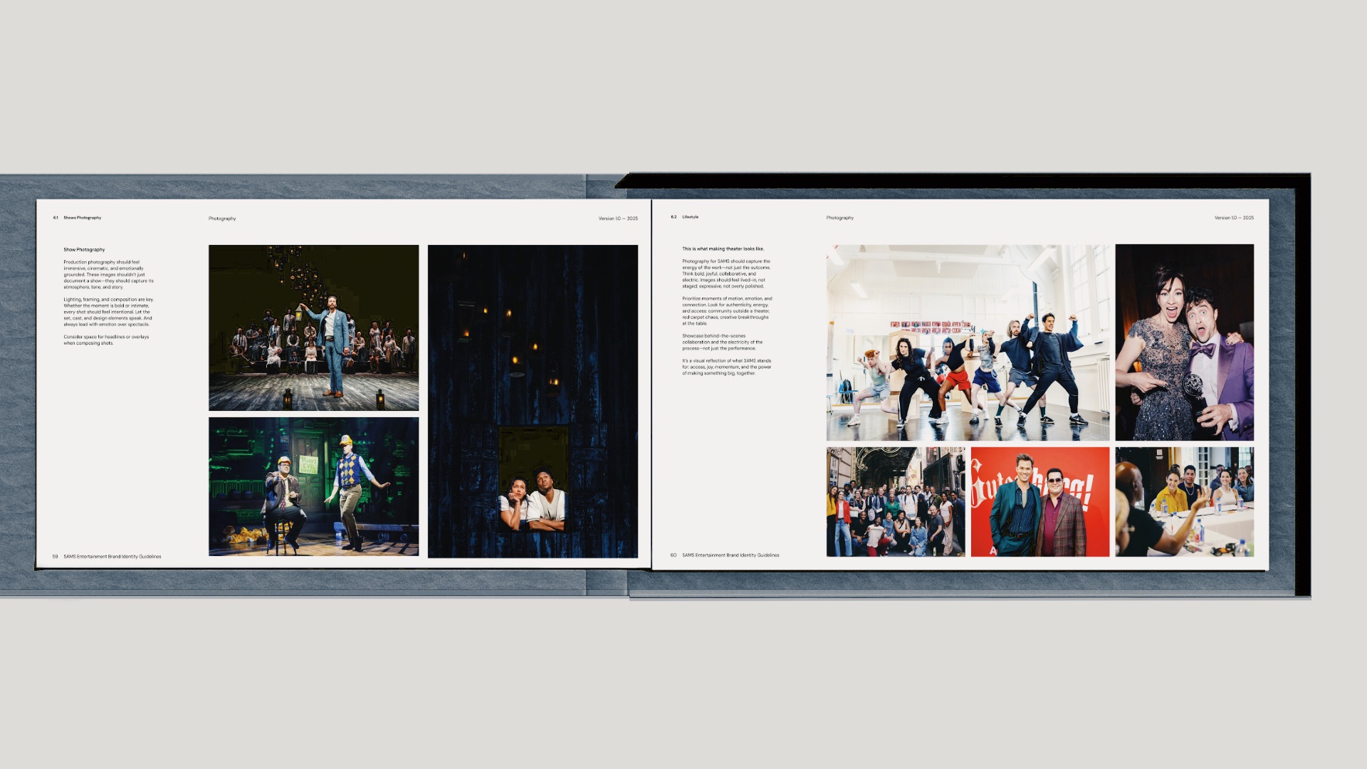
PlanetFab brought the wordmark, color palette, typography, photography, messaging, grids, and templates together into a complete brand system. The system gives SAMS consistency while leaving room for the individual character of every production.
The Website
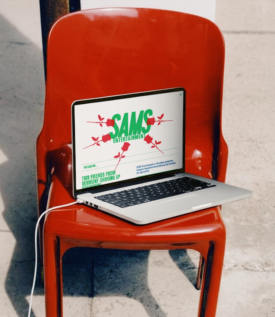
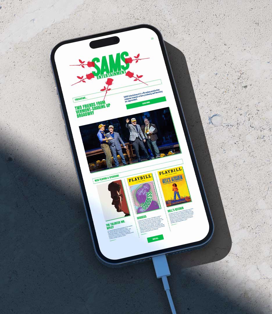
PlanetFab designed and developed samsent.com as the primary expression of the new brand and a working platform for the company’s productions, investors, and news.
The site needed to establish credibility with investors and industry partners while retaining the energy and personality of its founders. Bold typography, Vermont Green, Champlain Blue, and a direct editorial layout give the website a presence distinct from a conventional Broadway producer site.
The roses on the homepage were inspired by the theatrical tradition of throwing flowers onto the stage. Scattered around the SAMS wordmark, they introduce celebration, movement, and a sense of live performance into the digital identity.
The information architecture balances that personality with clear business functions. Production, investing, and news sections make the website part production archive, part investor platform, and part company newsroom, with a flexible structure designed to grow alongside SAMS.
The Outcome
SAMS emerged with a name and identity built around the real foundation of the company: the partnership between its two founders.
The move from Samsational Entertainment to SAMS Entertainment brought the company’s name, positioning, identity, and communications into alignment. The original personality was not discarded. It was given a more purposeful place through MAKE IT SAMSATIONAL.
Across its website, investor materials, production credits, and marketing applications, SAMS now presents one coherent idea: two producers, one company, and a shared approach to making theatrical work.
Since the rebrand, SAMS has expanded its producing slate across Broadway and the UK. In 2026, SAMS was named as a producer of the European premiere of The Jonathan Larson Project and credited as a co-producer of Schmigadoon!, winner of the Tony Award for Best Musical.
READ LESS −