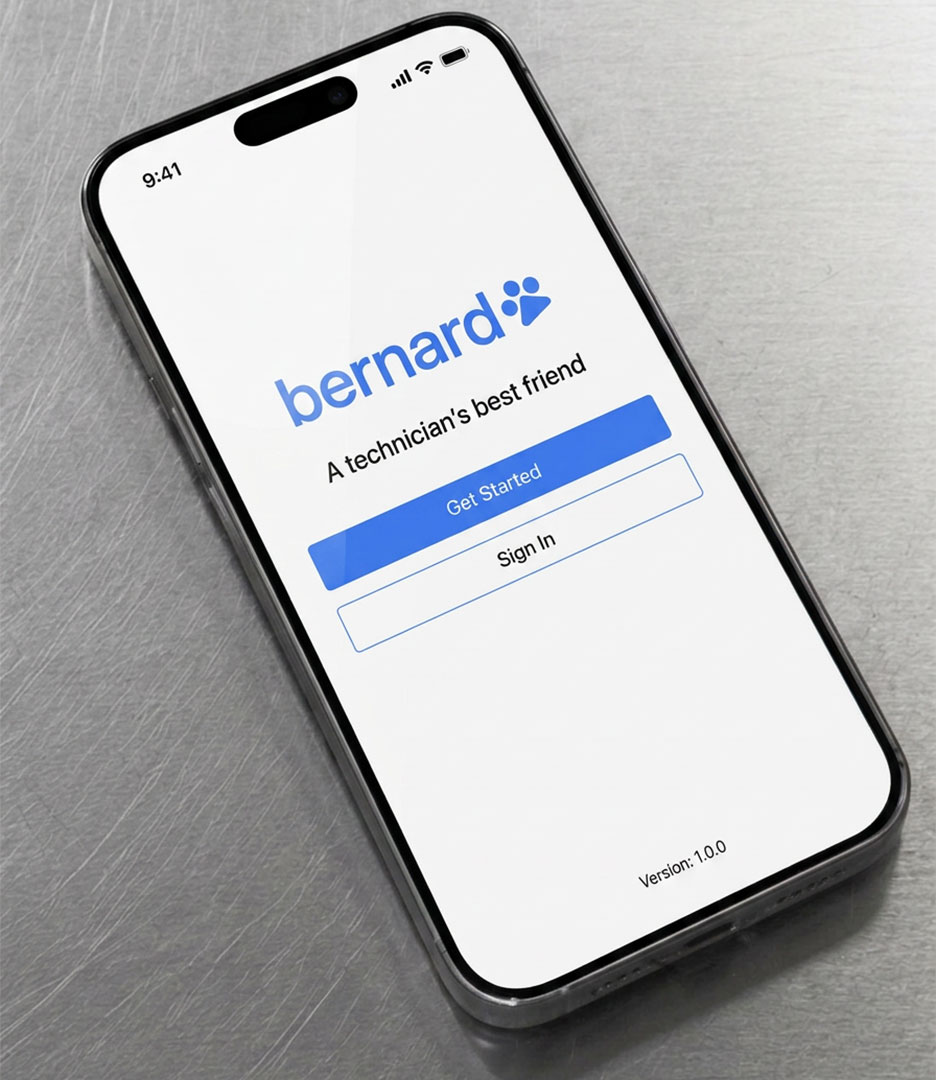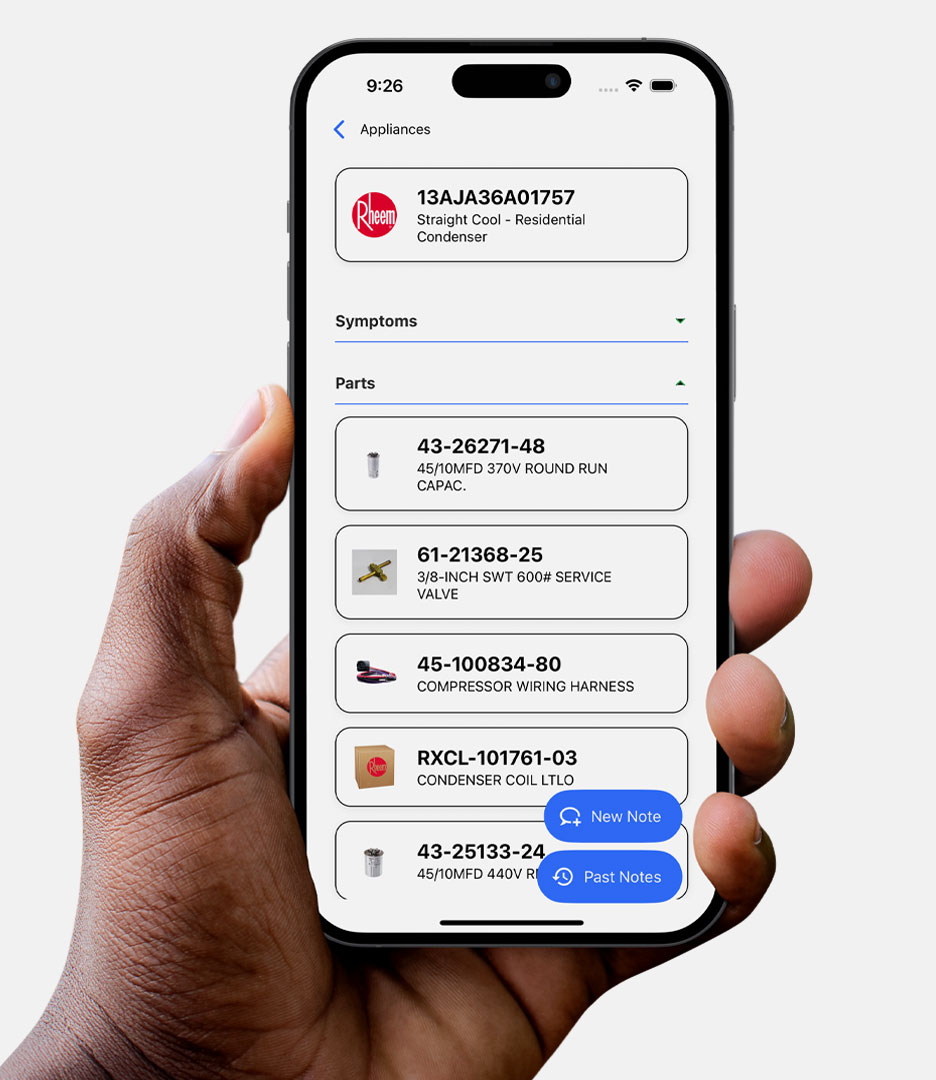
PlanetFab partnered with Bernard, an AI-powered platform for appliance repair and HVAC technicians, to develop its brand strategy, positioning, investor narrative, visual identity, and marketing website.
The Bernard Brand Challenge
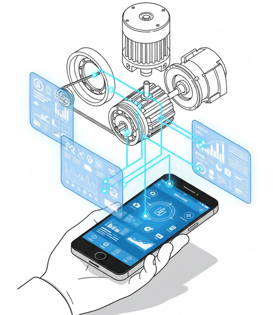
Bernard arrived with a working product, an ambitious team, and a strong point of view about the future of repair. As appliances become more connected and sophisticated, the knowledge required to service them is harder to access. Experienced technicians are retiring. Documentation is fragmented. Expertise walks out the door when workers leave the field.
Bernard was built to solve that. The problem wasn’t the vision. The problem was that the brand didn’t show it.
Externally, the story was still about features. And the face of the company was a Saint Bernard mascot.
The Strategy
The strategic shift was simple: stop talking about what Bernard does and start talking about what it makes possible.
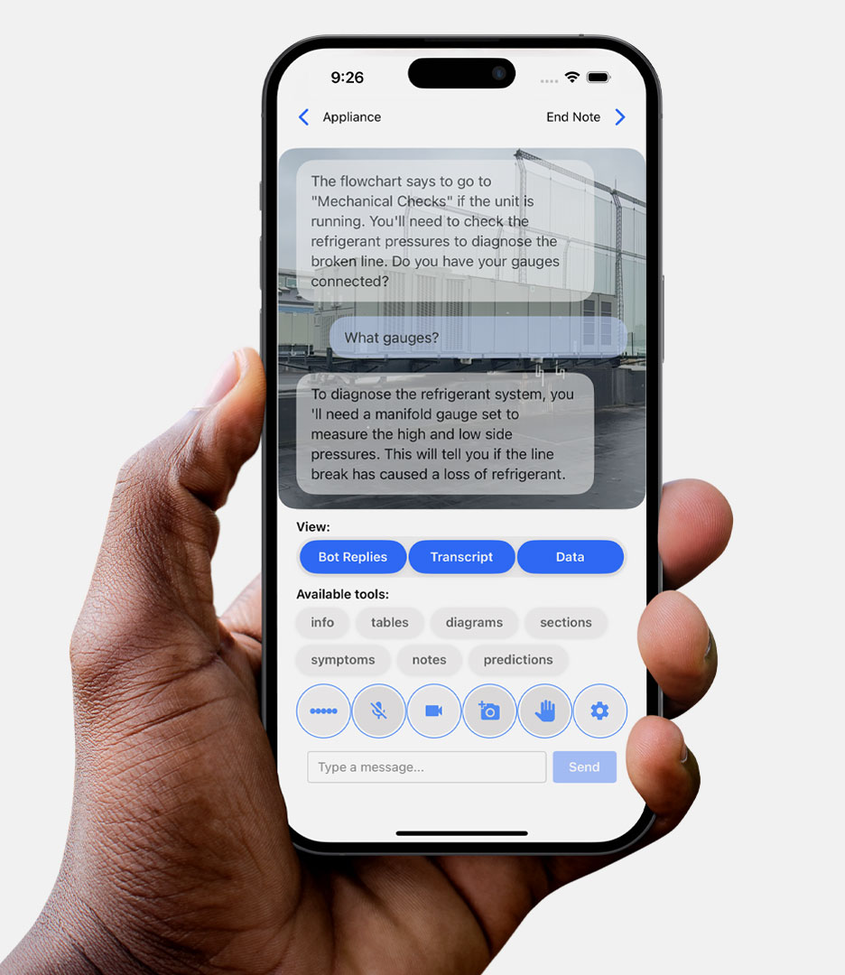
Bernard wasn’t helping technicians fill out paperwork faster. It was putting knowledge, guidance, and experience into their hands at the exact moment they needed it. That distinction, from tool to co-pilot, became the foundation for everything.
The conversation shifted from features to outcomes. From software functionality to the people keeping the industry running.
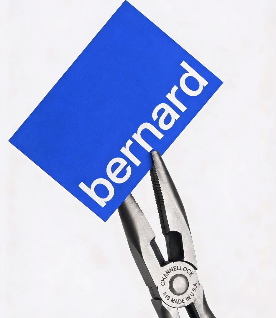
From Mascot to Mark
The identity had the same problem as the messaging: it described the name, not the purpose.
We explored Saint Bernard imagery in every direction. Each concept arrived at the same dead end, another dog logo. So we stopped trying to draw a better dog and asked a different question: what has the Saint Bernard always represented?
Trust. Reliability. Guidance. Showing up when it matters.
Those qualities mapped directly onto Bernard’s mission. The answer wasn’t a better illustration. It was distilling that meaning into a mark that could grow with the company.
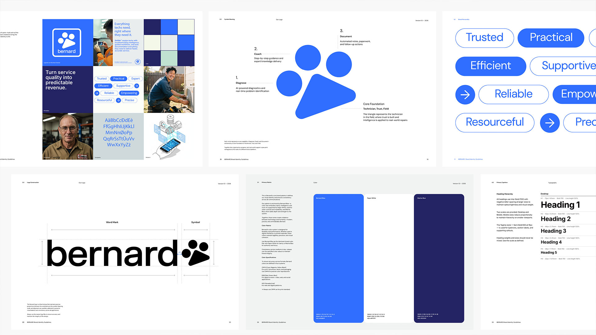
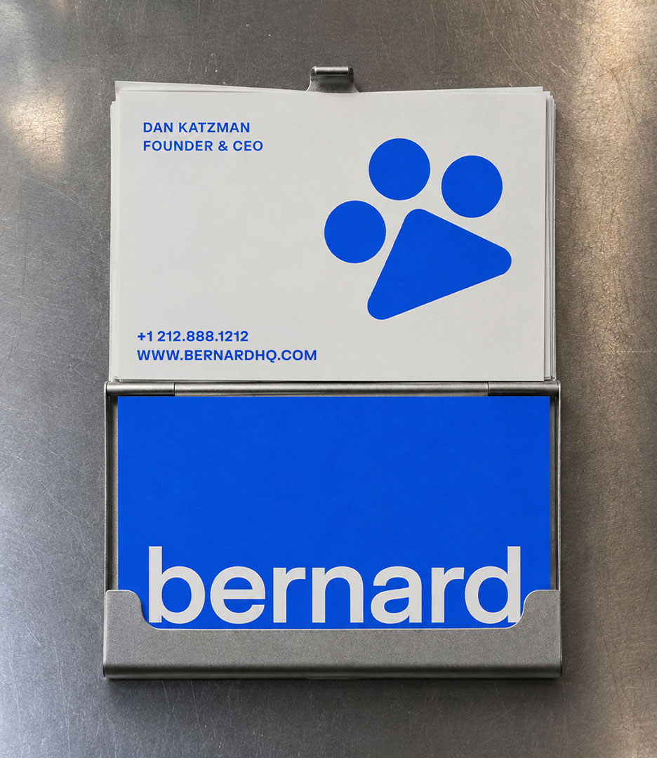
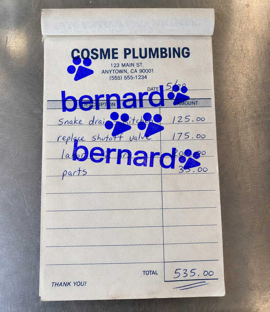
The result is a reimagined paw print. Three circles, not four, each representing one of Bernard’s core capabilities: Diagnose, Coach, Document. Beneath them, a triangular form representing the technician in the field. At first glance it reads as a paw. On closer inspection, it reveals the structure of the platform itself.
What began as a mascot became a system. What began as a name became an idea.
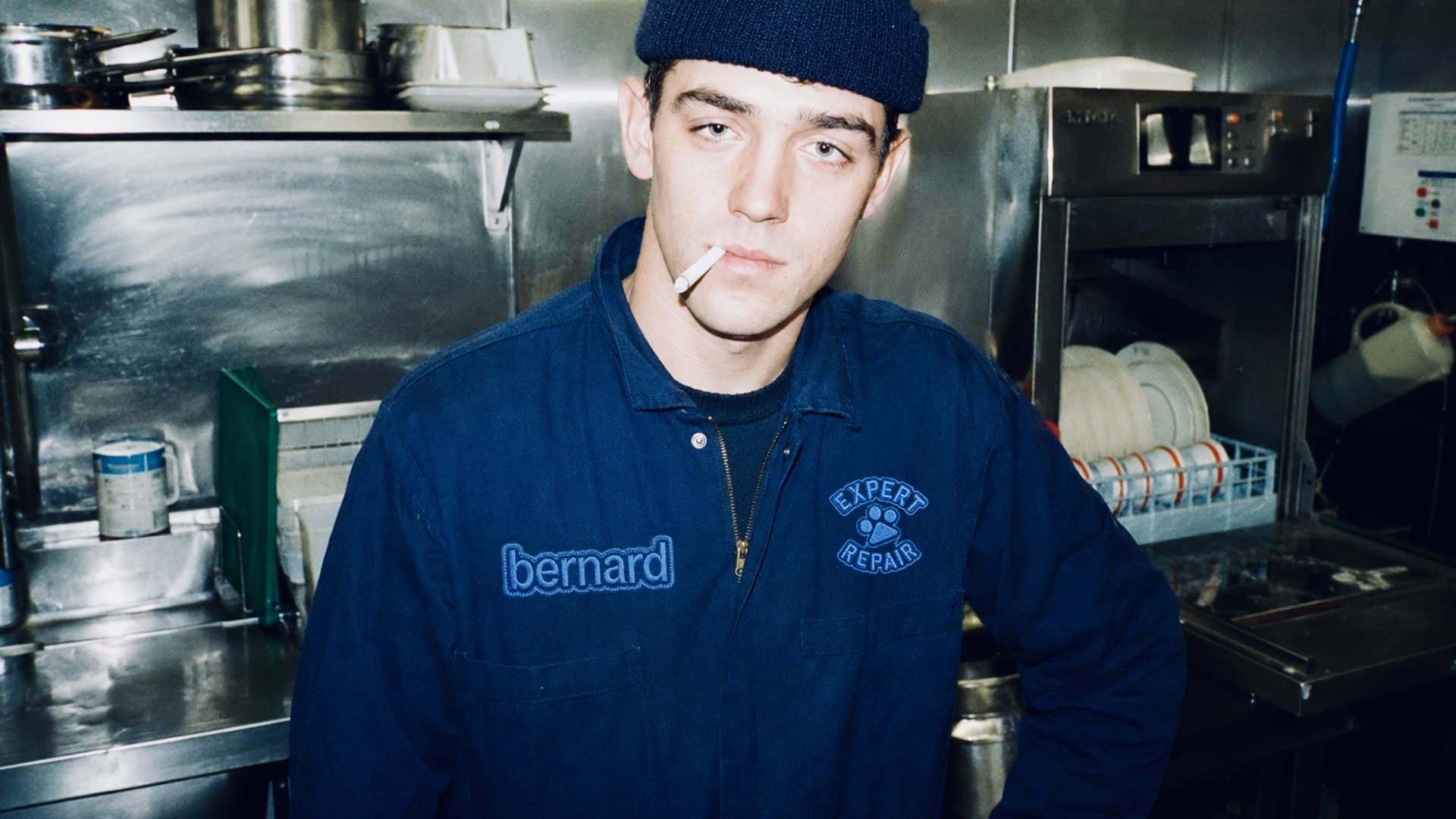
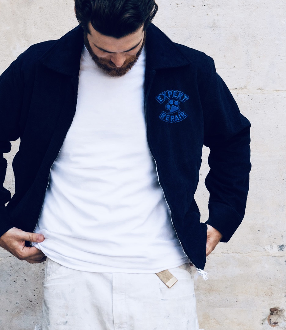
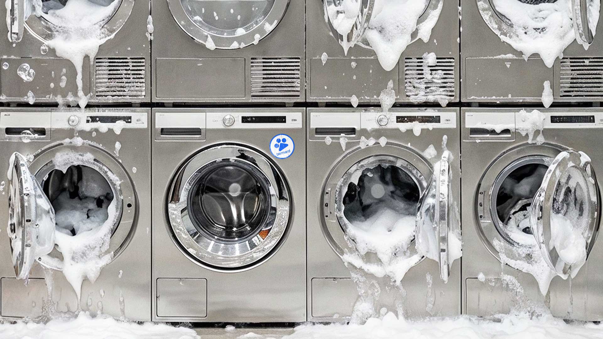
The identity extended into a custom wordmark, a bold blue palette, and a visual language drawn from the trades: technical diagrams, service documentation, workwear, tools, and the culture of repair.
Investor Narrative & Website
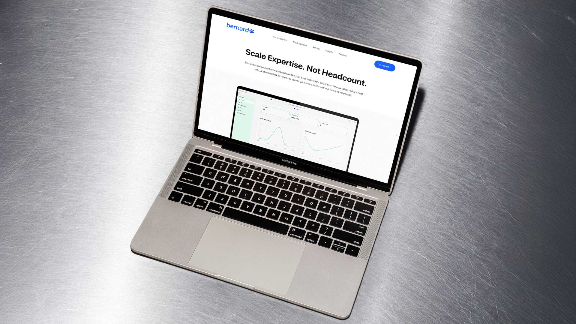
With the brand established, we turned to Bernard’s pitch materials and marketing website, both built around the same strategic frame.
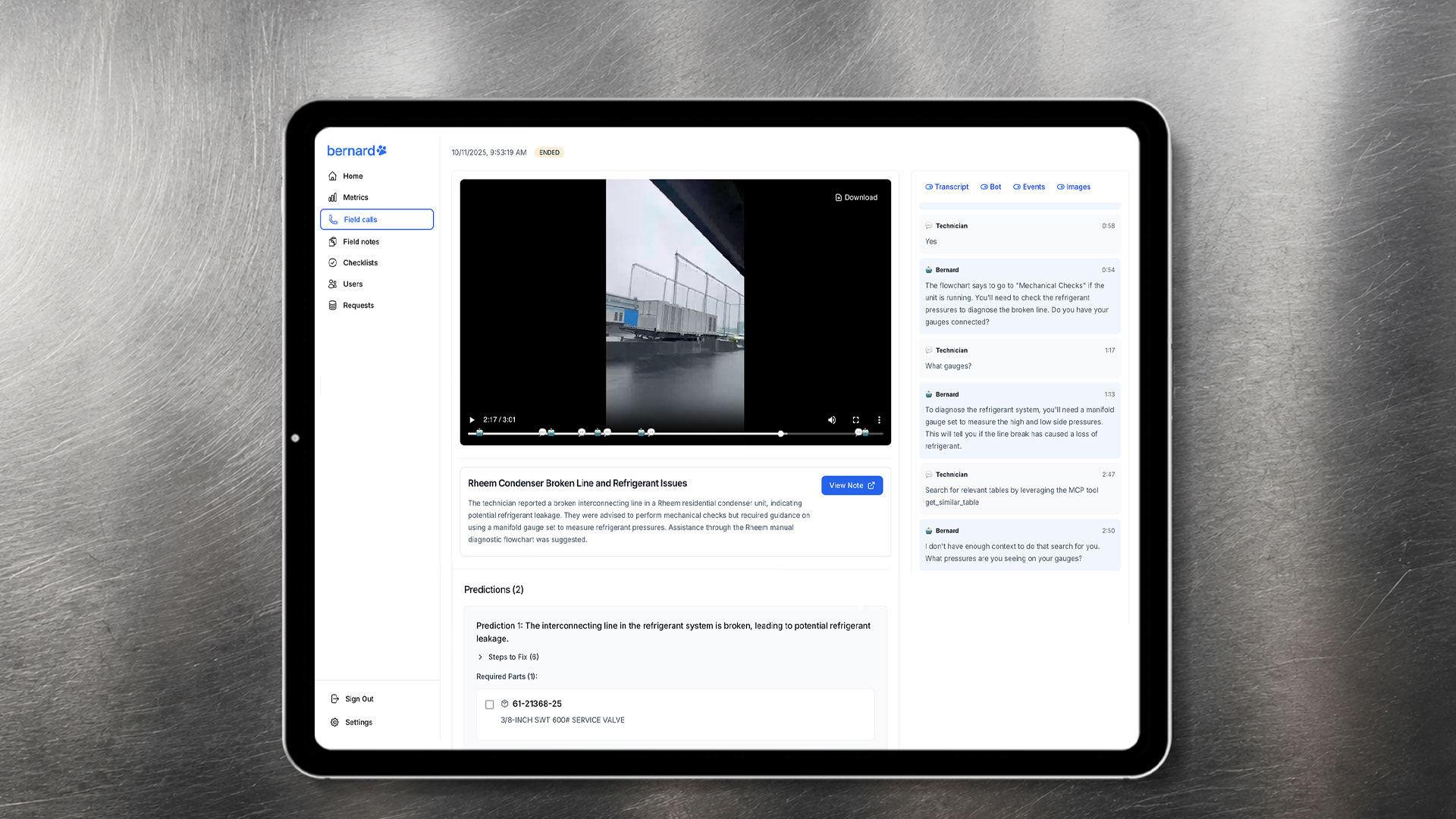
The investor narrative connected industry challenge to market opportunity to product in a single, coherent arc. The website did the same for anyone landing on it for the first time: not just what Bernard does, but why it matters and who it’s for.
The Outcome
Bernard emerged with a clearer strategic position, a scalable identity system, and a brand capable of supporting its long-term ambition.
More importantly, it no longer felt like a software product with a mascot attached to it.
The Strategy
The strategic shift was simple: stop talking about what Bernard does and start talking about what it makes possible.
Bernard wasn’t helping technicians fill out paperwork faster. It was putting knowledge, guidance, and experience into their hands at the exact moment they needed it. That distinction, from tool to co-pilot, became the foundation for everything.
The conversation shifted from features to outcomes. From software functionality to the people keeping the industry running.
From Mascot to Mark
The identity had the same problem as the messaging: it described the name, not the purpose.
We explored Saint Bernard imagery in every direction. Each concept arrived at the same dead end, another dog logo. So we stopped trying to create a better dog and asked a different question: what has the Saint Bernard always represented?
Trust. Reliability. Guidance. Showing up when it matters.
Those qualities mapped directly onto Bernard’s mission. The challenge was distilling that meaning into a mark that could grow with the company.
The result is a reimagined paw print. Three circles, not four, each representing one of Bernard’s core capabilities: Diagnose, Coach, Document. Beneath them, a triangular form that serves as both a foundation and a subtle play button, reflecting Bernard’s role in helping technicians move forward with confidence. At first glance, it reads as a paw. On closer inspection, it reveals the structure of the platform itself.
Rather than borrowing from the aesthetics of technology, the identity drew from the world technicians inhabit every day: service manuals, technical diagrams, tools, workwear, and the practical culture of repair.
Investor Narrative & Website
With the brand established, we turned to Bernard’s pitch materials and marketing website, both built around the same strategic frame.
The investor narrative connected industry challenge to market opportunity to product in a single, coherent arc. The website did the same for anyone landing on it for the first time: not just what Bernard does, but why it matters and who it’s for.
The Bernard Brand Identity Outcome
Bernard emerged with a clearer strategic position, a scalable identity system, and a brand capable of supporting its long-term ambition.
More importantly, it no longer felt like a software product with a mascot attached to it.
READ LESS –