equality charter school

we’ve got class

a rebranding revolution

project

ECS: 360 Rebrand

INDUSTRY

Education

WHAT WE DID

Art Direction, Branding, Campaigns, Copywriting, Creative Direction, Graphic Design, Identity, Naming, Out of Home, Print, Project Management, Prototyping, Strategy, Website Design, UX/UI

creative direction: fabrice frere, michelle keller
art direction: michelle keller
copywriting: michelle keller, fabrice frere
illustration: michelle keller
website design: michelle keller, fabrice frere

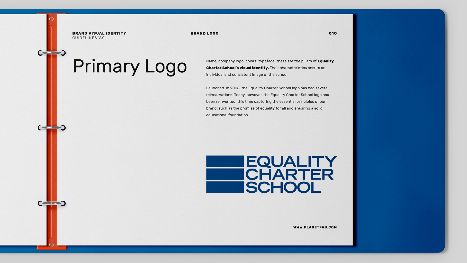
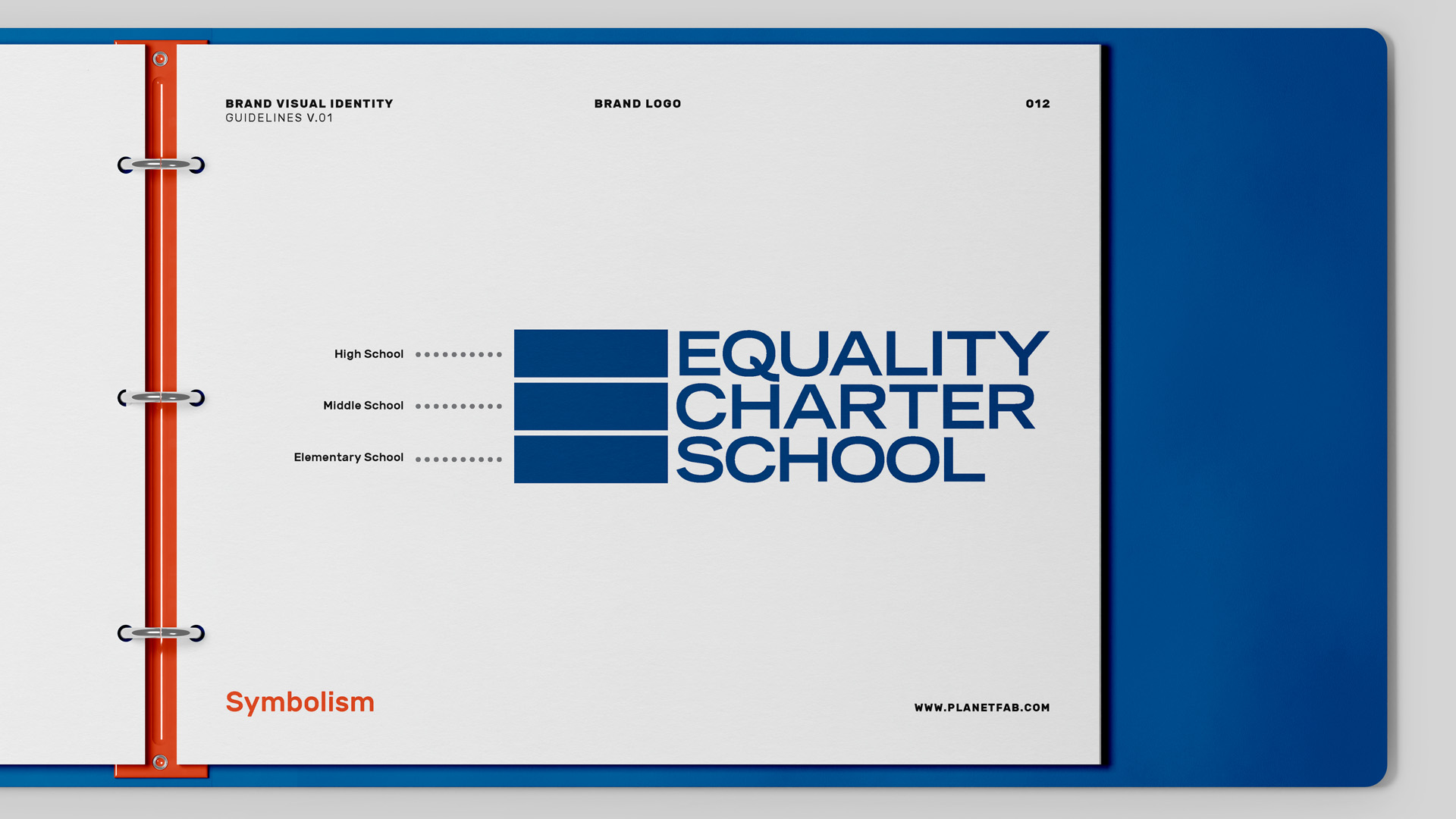
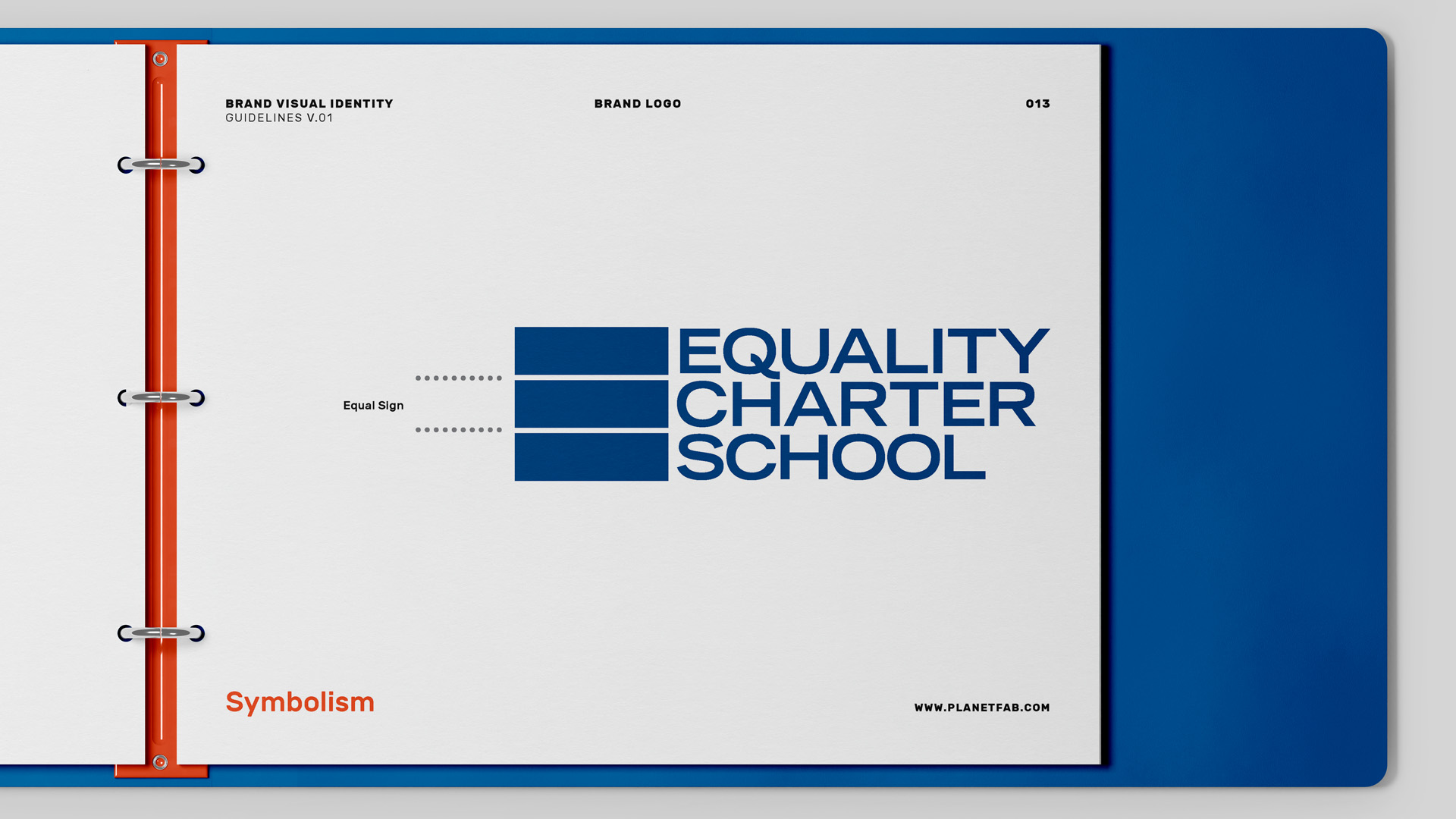
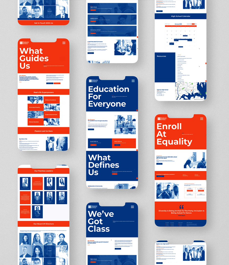
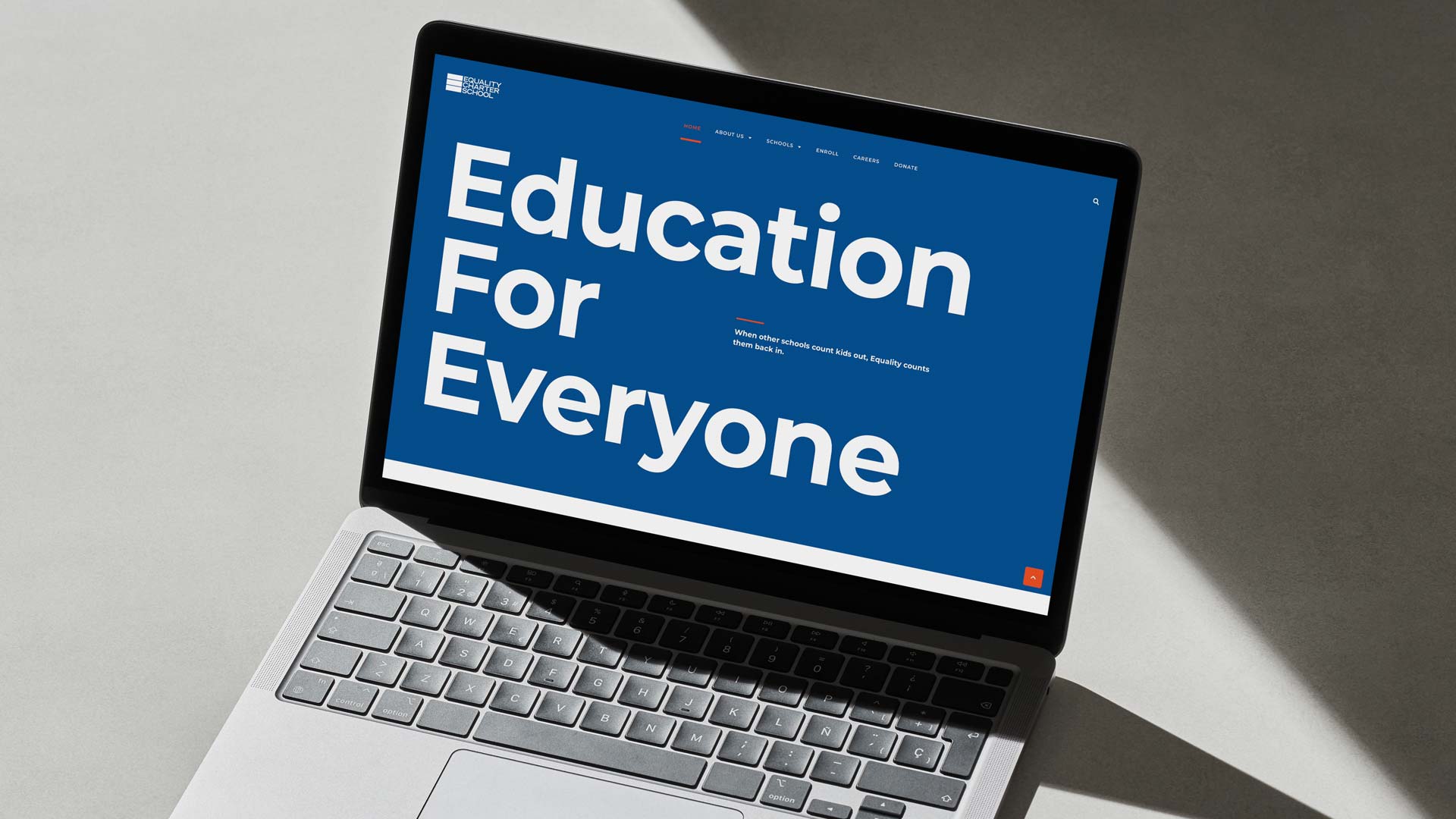
Equality Charter School (ECS) is dedicated to serving every student, regardless of their prior academic performance or needs, including those who are underperforming or come from families requiring additional resources. In the 2019-2022 school year, ECS partnered with PlanetFab to reshape the school’s offerings and redefine its direction, playing a pivotal role in crafting a new ethos—a catalyst for a remarkable transformation. Today, however, Equality Charter School’s identity has been reinvented, this time capturing the essential principles of the brand, such as the promise of equality for all and ensuring a solid educational foundation.


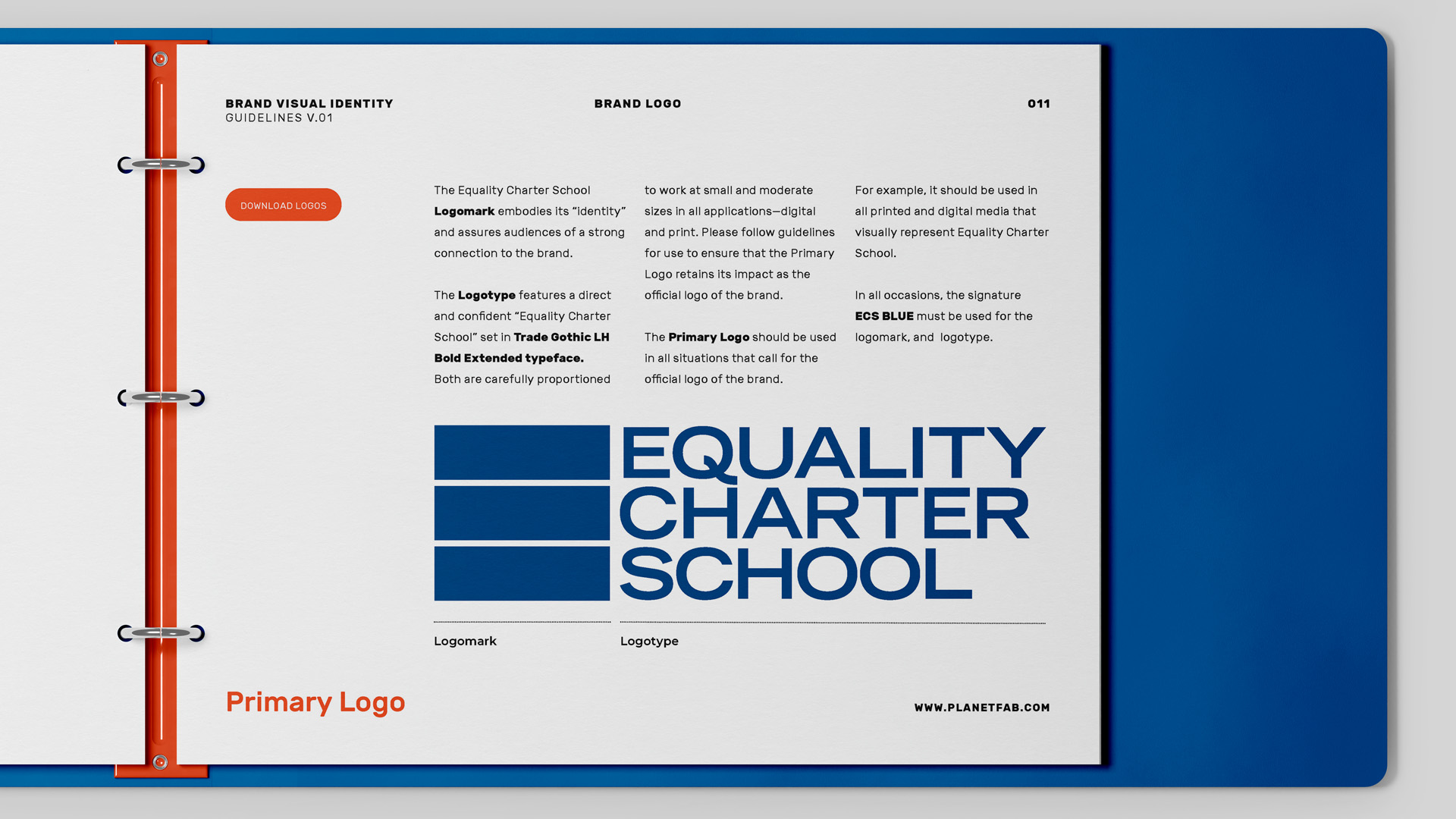
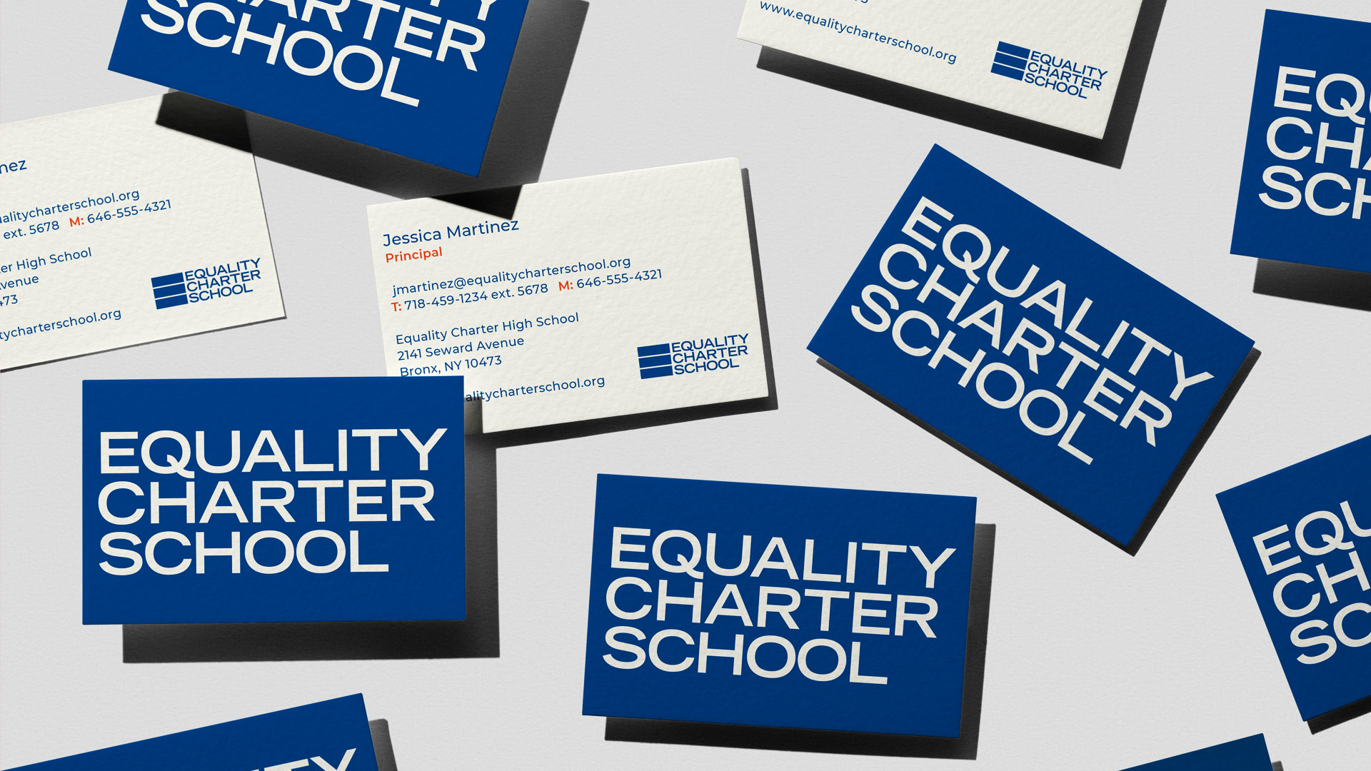
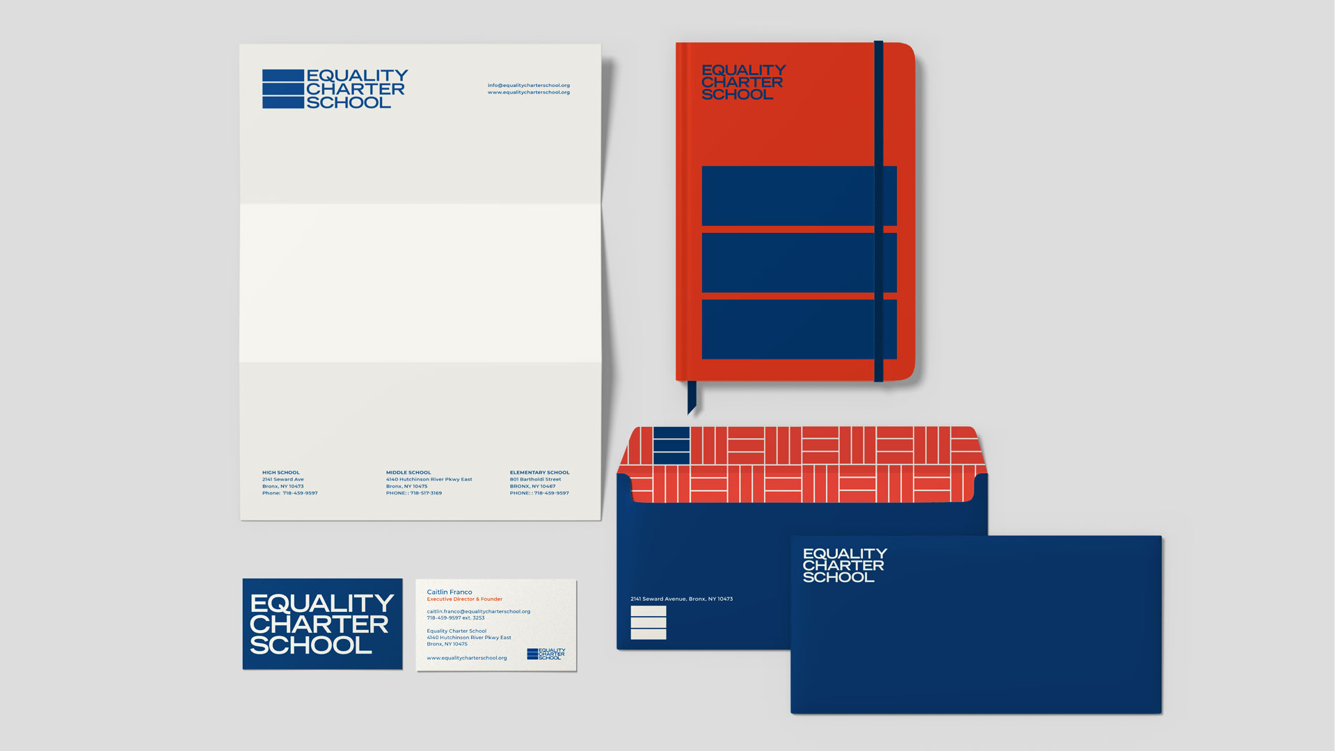
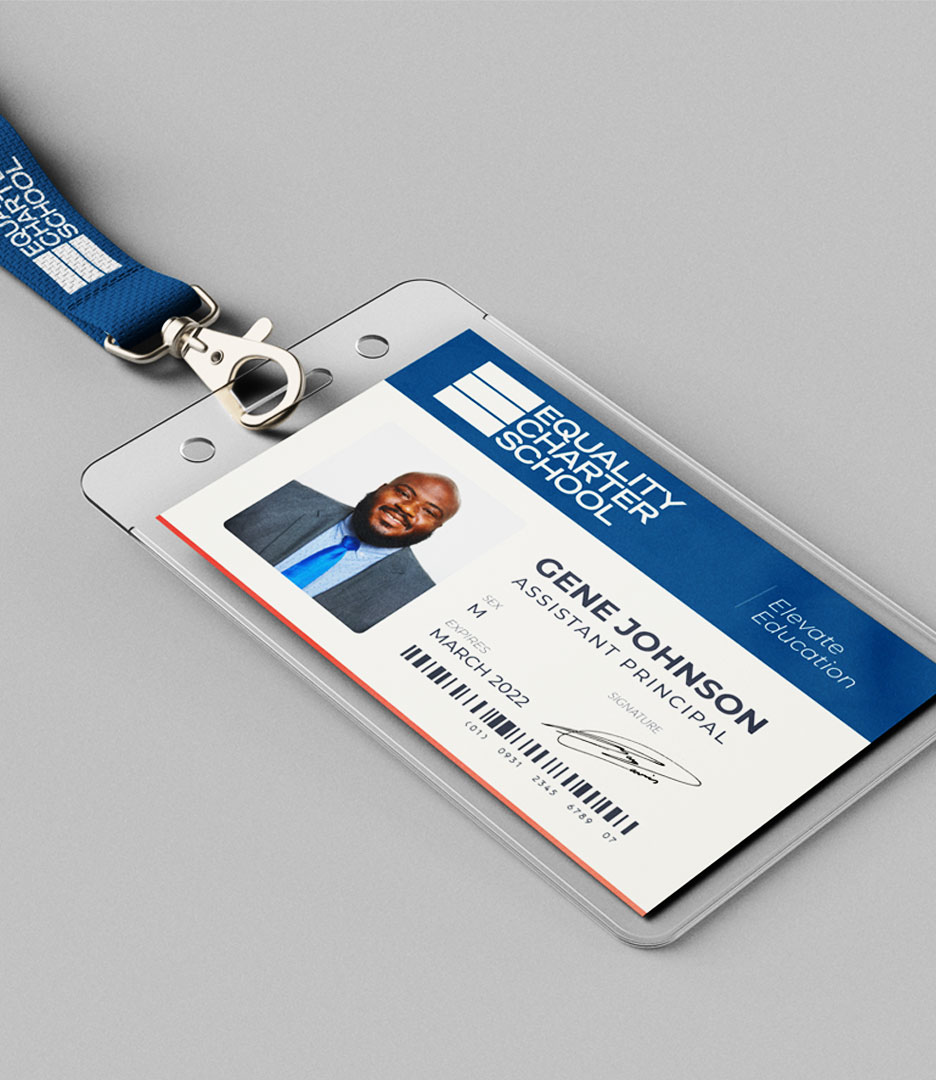
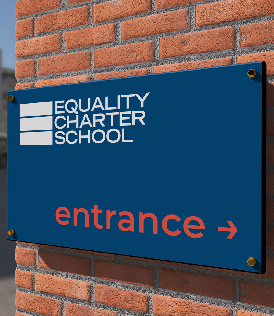
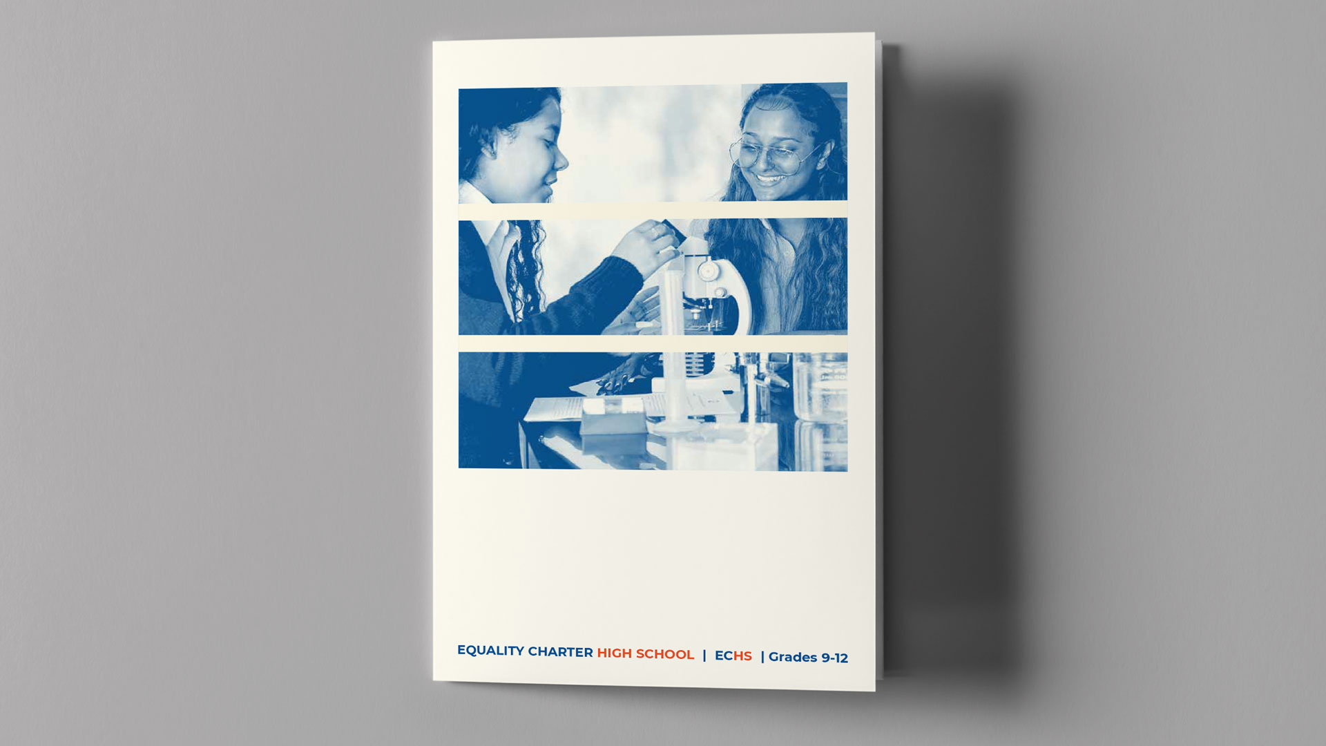
As ECS achieved major milestones and gained recognition for its success, PlanetFab proposed a more formal rebranding effort—the overarching goal was not merely a visual facelift but a strategic effort to modernize ECS’s profile and communicate its brand more effectively. This new strategy led to a bold, fresh visual identity system to clarify the school’s message and elevate its brand to reflect the organization’s significant strides toward becoming an impactful educational institution.

The subtly simple logomark crafted by PlanetFab represents not only a hidden equal sign for the school’s mission but also notes education as a progressive and additive process over time. From grade to grade and year to year, scholars add to what they had learned previously. Inspired by this, the logo shapes become a brand system of carefully and meticulously laid building blocks, advancing from one level of education to the next.


ECS’s brand color palette is bright and academic, anchored by the main color, a deep, saturated blue, sometimes accompanied by red/orange in certain applications. The background color is an ivory white and is used in specific situations to replace white.


The Equality Charter School logomark embodies its “identity” and assures audiences of a strong connection to the brand. The logotype features a direct and confident “Equality Charter School” set in the Trade Gothic LH Bold Extended typeface—a clear, instructional, clean sans-serif typeface with a straightforward and neutral design. Both are carefully proportioned to work at small and moderate sizes in all applications—digital and print.


PlanetFab brought the identity to life through a dynamic website experience, full stationery suite, marketing collateral, signage, uniforms, custom-branded templates, and a variety of merchandise, to take Equality Charter School into their next chapter.


I want to thank you for your hard work. Everything has come out so fabulous! I am really grateful for all that you did to make it as incredible as it has all become. I've received a few texts today from faculty, friends and family who just love it. GREAT WORK :)
Caitlin Franco
Equality Charter School

stuck in the status quo?