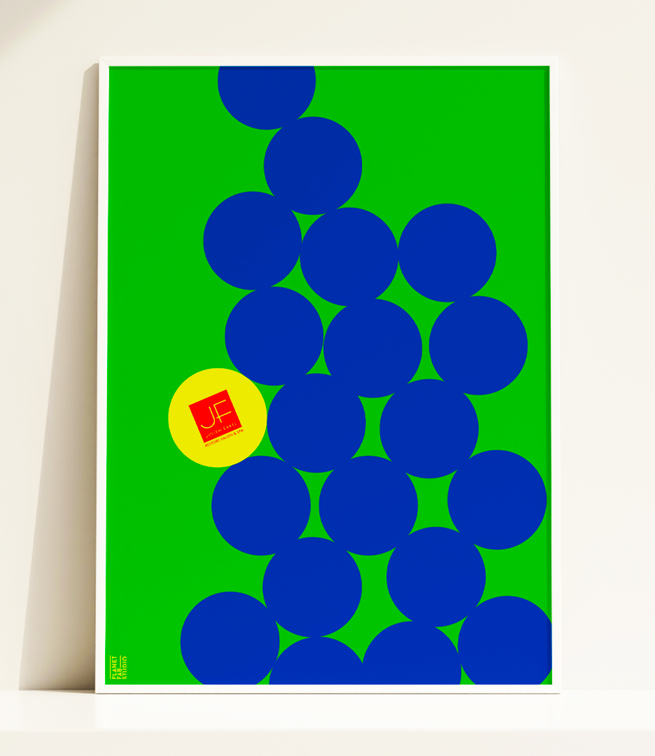
This striking poster showcases Julien Farel’s brand campaign in a tennis-inspired design. A cluster of blue circles, representing tennis balls, against a vivid green background. The Julien Farel ‘JF’ logo appears in red on a yellow circle, strategically placed within the cluster. The design cleverly combines tennis imagery, reflecting the brand’s association with both the US Open and high-end beauty services. The poster’s minimalist style and bold color choices create a memorable visual impact.